Film school:Completed Homework Assignments

Courses in Filmmaking →
Course #1:
Basic filmmaking (pre-production)
Course #2:
Practical narrative film editing
Course #3:
Film scoring for dramatic scenes
Exercise:
Script writing for high school dramas
Future:
Poser / DAZ Studio animation


Completed Homework Assignments in in
Narrative Film Production

Template:Film Scoring for Musicians:Velocity:Completed Assignments

Homework and Pop Quizzes: Basic Filmmaking

Basic Filmmaking Assignments
Below are all the completed assignments in the Basic Filmmaking course by Wikiversity Film Students.

Film School:Script Formatting:Completed Assignments

Homework
Homework
The formatted scripts from the lesson on "Script Formatting"


Version: The Live-Action Script
Note: The instructions in the lessons are only a guide. Here is an excellent example of creative script formatting. Converting the story into a script can be done with a great amount of originality. Great job, Capt. Mike!
"D" says: I wasn´t sure if could make all this changes in the story but here it goes! (Ps: sorry if the script its not fluid or something but though english its not my native language I wanted to give it a try anyway.)
  • MilesR has completed this assignment (pdf). 10 points. (5 May 2007) Remember to set each line to the correct format. This is very easy in Final Draft.
  • Krishna Datta has completed this assignment (pdf). I used MS Word and converted the script to PDF using a PDF Convertor. I am not able to install the Tool as I am using a restricted Computer where I don't have permission to install any software. I think this will suffice.6 points. (23 July 2007)
  • Astroboi has not completed this assignment (pdf). Please use the free demo of Final Draft to format this script.
  • Igor Popovski has completed this assignment (pdf) using the free Final Draft demo. This was done using a TV format rather than a motion picture. The differences are very interesting. 8 points - (03 November 2007)


Click on the word assignment to see the actual pdf document.


Version: The Animation Script
  • Special Note: This is the first script to get the scene numbering correct!!!!
  • Special Note: This is the second script to get the scene numbering correct!!!!


Unique scripts


Completed assignment - Script formatting

June 3, 2010 -- Macurik has formatted the script with Free Final Draft 8. You can download it at Media:Macurik_Seduced by the dark side.pdf. xxx


Film School:Storyboarding:Pop Quiz:Answers

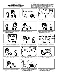
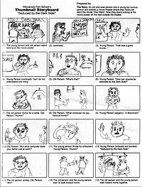
Answers to the Pop Quiz on thumbnail storyboarding.
Pop Quiz
Pop Quiz
What is the first frames of the movie?


Elatanatari selects this images as the first frame of his movie - 2 points.


Pedromax says, "For first shot, I'd choose picture no 10 and would pull back the camera to frame the two characters, just like image 8 shows. Opening with the vision of the poster would mark the conversation object to the viewer right from beginning." - 4 points


Fat Penguin says, "For first shot, I propose frame 11. This frame gives a clear view of the characters' faces, this catches the viewers' attention, now they will be wondering what are the two persons looking at? Who are they? And that's why for second shot I chose frame 15, a clear view of the surroundings where also the movie poster is visible." - 4 points


Quintana4 says, "I would chose frame #1 as the first shot, as it serves as an establishing scene, immediately answering "who" and "where". Frame #6 would would comprise the second shot and would reveal the characters faces and focus on the young adult's starting dialogue." - 4 points


Still Life says, "I would start with frame #6 because the story starts with the young person's confusion and ends with her/his lightening. So it would be nice to distinguish the young person from the old one. It also makes us wonder what they are looking at. I would go on with frame #10 to tell the audience what they are talking about." - 4 points


· Version 1: "As classical as can be"

Greg From Austin says, "I will start with an establishing shot (thumbnail 1). In this case, I would eventually add ESTABLISHING to the scene heading in the script. I will then move closer (and knowing that the young person will talk first, I may very well go with shot 17 (and therefore make the decision that the line of action goes from the poster to the younger person, and that I will not cross it)" - 4 points


· Version 2: "A little more creative"

Greg From Austin says, "My own preference would be as follow: 11 then 10. And I will start the dialogue (the young person saying it was a great movie) while still on frame 10. It doesn't show the movie theatre as well as the first version, but it gives more intimacy with the characters and gives makes the movie itself more important." - 2 points extra credit


Bobilobio says, "The over the shoulder shot is a good angle that captures both characters in the story as well as the poster, which is the subject at hand. Without the poster somewhere near the beginning frames, the meaning would be lost on the viewers. " - 4 points


Aryansri says, "I would first take number 10 because it would show the poster and give the audience an idea about what the subjects are looking at. Then I would go for number 3 as it would show us the subjects. The audience would be able to understand the situation (i.e it is a movie theater) in the first shot and the people involved in the second shot." - 4 points (13 February 2007)


Tedrick022 says, "For the first shot I would probably choose #8 because it clearly presents the scene, it shows both characters and the poster. For the second shot I would choose frame #13 because it clearly defines the young person as the speaker while still keeping the older person and the poster in the scene, this reinstates the scene while showing that the child is about to say a line. " - 4 points (13 February 2007)


Koolaidman says, "The first shot is 8, it shows the two people standing in front of the poster. If 8 weren't there I would have chosen 1 but I like 8 better because it doesn't have all of that white space around the people like 1 does.

The second shot is 13 because it shows the young person turning to the older person getting ready to talk. " - 4 points (19 February 2007)


L. K. LaRose says, "Shot #1 anchors the scene the two characters outside of the theater looking at the poster, giving us time to lead into the characters. Shot #3 then establishes the characters, the older wiser person and the younger person, as they continue to contemplate the poster. The camera moving from shot 1 to 3 establish suspense with the audience." - 4 points (21 February 2007)


Forbe says, "The first shot should be shot 10, the big poster shot. It introduces the subject of the Star Wars film and gears up the audience for the deep Star Wars discussion about to take place between the two people. Shot 16 should be second--this shot ties in the personal aspect of the film, and hints at the thought running through the young person's mind ("How is someone seduced by the Dark Side?"); it also stays in smooth sequence with the first shot--the audience can tell by the angle that the young person is looking at the poster. " - 4 points (10 March 2007)


Cluv138 says, "Shot number 10 then shot Number 8." - 4 points (21 March 2007)


Deimos says,
"Shot 1

I have made my own shot. Its a kind of wide shot, framing the movie theater from outside, you can see the main movie board, the box office, footpath, road and the poster n subjects. The poster is illuminated from the top, the light also falls on the subjects. This I feel is a essential first shot, coz it summarizes to the viewer about the location where this incident is taking place. And as the subjects are illuminated by the light on the poster, they wont be missed in all the hub-bub on the street.

Shot 2
For shot 2, I will choose image number 15 from your list, its a close up shot. The frame shows the poster, which immediately becomes the center of interest coz both the subjects are looking at it. Its also a introduction shot of both the subjects, though the angle of the camera doesnt completely describe the younger character (shows back of the head), shifting the angle a lil bit will do the trick." - 4 points + 2 points for an original drawing (22 March 2007)


Cameron is the best says,

"1st shot - #15: It automatically grabs my attention and makes me question why they are staring at the poster.

2nd shot - #22: It shows the older person as larger which makes him/her look wise and intelligent, The younger person's head it tilted upward towards the older persons as if they admire them. " - 4 points (24 March 2007)


The Mirror says,

"1. A panoramic view, moving very slowly to the interest point: the movie theatre. Is the place where the question appeared, a magic point, a place where the seeds of multiply possibilities come to life.

2. The young person face and his expression of wonder. Everything dies in his eyes and becomes part of his mind." - 4 points (5 April 2007)

Note from Instructor: Remember, a script can be turned into an animated motion picture which can have very unusual visualization. This movie does not have to be realistic live action. Always keep an open mind when you read a script. This is an excellent example from The Mirror.


Kroebuck67 says,

"I would use Deimos described first shot (21) with the additional action of the Young Person and Old Person exiting the theater, to stop in front of the marquee.

My second shot would be 15, as it would transition best into the upcoming dialogue. " - 4 points (16 April 2007)


Jack21 says,

"My answer would be #12 and #13." - 2 points (21 April 2007)


Kinsuji says,

"On the first shot, I would use no. 21. I would like to show to everyone where everything is going on. The time of a day, the place of action. Then with slow zooming (if possible) to pict no.1. It would still be the one shot I think. And it would fit the best for my script too :).


For the second shot, I would choose no. 4. It would best represent the both characters. From that shot everyone can see clearly the young and the old person. Differences between them. Emotions and gestures they make (again from my script).

I can explain why I didn't chose a shot where you can clearly see a poster. (If slow zoom to pict no.1 is impossible.) First of all in pict no. 21, you can see the name of the movie and the small poster itself. And the in the shot no.4, it is obvious that they are looking at the poster. The viewers imagination would make bigger impression than the bigger poster on screen. (In my opinion of course:)) " - 4 points (26 April 2007)


Stewart says,

"For the first shot, I would use shot #1, because I want to communicate the focus on the poster to the exclusion of anything else. Second, I would use shot #22, since in my script, the young person is the first to speak. The camera is pointed at her face already, and the first dialogue in the script is the younger person's question to the older person---when the older person speaks, this camera angle gives the best angle for such an effect." - 4 points (29 April 2007)


Eze says,

"21 for the first shot because it feels like an establishing shot. People coming out of the cinema, cars passing by... 8 for the second because you can inmediately see the poster and the two characters involved. Afterwards I would use the close ups." - 4 points (30 April 2007)


Ltjlogic says,

"Question 1:

I believe the first shot could be shot number 21. It is the first shot of the short movie and it shows the movie theater, and the two people standing next to the poster. This gives the viewer all the information that they need to be able to understand that these two people are at the movies, that it is at night, and you briefly see that there are two subjects, which later we will get more information when they converse.

Question 2:

For the next shot, I would choose number 15. I chose this shot because it is more interesting than 8 or 1. It's a lot more interesting to see something with more perspective than two people standing parallel to the wall. With less perspective (shots 1 and 8) the shot is not as lively, we don't get the feeling of the 3D shapes as we do in shot 15. " - 4 points (1 May 2007)


BSB says,

"My pick for the first scene would have to be 21. The reason being that it is a wide shot during (preferably) dusk exposing not only the color scale, but more importantly the over all mood of the story and film.

My pick for the second scene would have to be number eight. Though it may look like a cheesy close up, it would show what the characters were looking at and show texture. Plus, it would signify the symbolic relationship between an older generation to a newer one." - 4 points (10 May 2007)


Havryliuk says,

"I chose picture 4 for the first frame. It shows the characters of the film. But the poster in not still there. So the viewer is wondering what they are looking at.

The second frame would be picture 10. It shows the poster in closeup. So that becomes clear what they are talking about." - 4 points (15 May 2007)


Fanninator says,

"For the first frame I would choose #10 because it shows the movie poster which is what they are looking at. Then I would pull back to #8 because it shows the characters looking at the poster." - 4 points (17 May 2007)


Munibaron says,

"Frame one is Pic 21

Frame two is Pic 1

Reason:

Pic 21 showing a high level theme of the Story.

and

Pic 1 can explain the initiation of the story clearly" - 4 points (17 May 2007)


Niri0n says,

Shot 1: 21

Shot 2: 3 or 4

"I want a very broad view of the first scene to set the context for the viewer. The second shot should show the persons involved. It should not break the 180 degree rule, so any shot taken from the side showing the old person closer to the camera would be bad. But any shot from behind or the side with the young person closer would be ok. I want the picture to show the emotions and state of mind of the characters. I would maybe choose a perspective a little higher up than waist, so maybe neck height." - 4 points (22 May 2007)

or

Continued on next page


Film School:Storyboarding:Pop Quiz:Answers2

Answers to the Pop Quiz on thumbnail storyboarding (continued).

Kasturika says,

"Answer 1:
As the story begins, the characters are introduced as standing outside the theatre so we should show the theatre first and then focus on the characters
By showing the theatre or a poster of the movie, we can create an interest in what is about to happen, we can then focus on the two characters. This way the viewer can understand in what context the people are talking.
Thus, the first shot should be of the poster, that is image number 10
Answer 2:
Once the poster is shown, we can focus on the characters. We must show both the characters as looking at the poster. Further, we have to show 'who' they are, that is, there is an old person and a young person
Image number 3 is suitable for this purpose. It highlights the curiosity of the younger person as well as the wisdom of the older person while they are looking at the poster " - 5 points (23 May 2007)


A. Straea says,

"I would choose frame 17, followed by frame 10. Frame 17 shows both characters, but is mainly focused on the younger person, giving the audience the impression that this younger person must be the character that moves the story forward. I would have it followed by frame 10, which explains what the two characters were looking at. At this point not much can explain the significance of the poster just yet, but it gives the impression that the two had just seen (or planning on seeing, if the dialogue isn't taken into account) that particular movie. " - 4 points (27 May 2007)


or

Disilver says,

"First Shot:

The set-up shot Image 21. This long shot of the exterior and characters sets the scene.

Second Shot:

Image 3. Curious Young Person (CYP) is probably our 'star.'

Image 22 is also good. Either shot gives us a more intimate look at the characters. The partial visibility of the movie poster helps put their conversation in context. These are both limited depth of field shots with the CYP in focus. But Image 3 emphasizes the CYP 'star' by putting her up front while the camera angle emphasizes the stature of the supporting Wise Older Person (WOP) in the background. These WOPs are the target audience we're flattering into a buying decision." - 4 points (30 May 2007)


Tpayne says,

"First Shot - frame 21. This is a great establishing shot. It shows the characters looking at the poster as well as showing the movie theater our characters just exited.

Second Shot - frame 4. I would use this shot when the young character starts dialog. We have already established where the characters are and what they are looking at, now this shot gives us a clear view of what both characters look like." - 4 points (30 May 2007)


Wachapon2 says,

"As a first shot I would use #21 because it gives us an establishing shot of the setting and then #15 because it gives us a better perspective of what the characters are doing and what is it that they are looking at clearly." - 4 points (2 June 2007)


Velvetborzoi says,

"I choose picture 21, as it shows a long shot of the 2 subjects with the whole background. The first shot should set the tone for the film, and give us a feel for the characters in it. For the second shot, i'll go with picture 20 which shows the older person closr to te camera, and the younger person away from it. It's a metaphor for the bigger, older, ? wiser old person, to whom the younger one looks up to. Finally, i would like to extend my appreciation to you and this site for sharing your expertise with the nebies. Thanks." - 4 points (6 June 2007)


AgentOO says,

"I have chosen to expand on frame 21 and create one for myself as an opener. All of the rest of the frames are great however they seem stagnant to me. They do not give the feeling of a just watched a movie as an opener; instead the characters seem like they are going to choose the film not review it. One of the main reasons I choose this route is more observational than anything else; people view the poster on their way in and rarely on the way out. I like the way that frame 21 also visually explains what movie is/was showing, what time of day it is, and possibly even that it might be a last show.

My Second choice is frame 13 this depicts the most interaction about a conversation after a film to me." - 4 points (19 June 2007)


Tunderboy9 says, "I think that should be the nr. 10 Because you begin by the poster and than the old person comes to the right side and the old person from the left side. And that is when they began speaking. The second shot should be the nr.8." - 4 points (7 July 2007)


Mok says,

Shot one:
It shows all the elements in the frame as a preface to the story, and to be the reference that makes us see the whole picture. It also puts a question “What they are looking at?” We are seeing the poster but we aren’t seeing its details.
Shot two:
“The poster” Now we could see the details clearly. Such details are the answer of the previous question. - 5 points (20 July 2007)


or

Izwah says,

My first two shots are #21 and #19 or #5.
Why?
My 1st shot is #21 because it establishes the scene with appropriate location, time, moods and atmosphere necessary for it. It also provides and introduction to the two main characters in this story - standing next to each other as the camera shoots closer to them.
My 2nd shot is either #19 or #5 because it establishes the young person's facial reaction, which holds the key to the subject brought up later by the dialogues. Shot #5 is acceptable because of the fact that it shows the facial reaction of the young person, but also recognizing the character next to the young person, so it won't be ignored by the viewers. - 5 points (21 July 2007)


Mpd1216 says, "I would use number 21 showing the marquee and zoom into the 2 characters. for the second scene I would use number 6 changing the focus between the characters as they each speak." - 4 points (21 July 2007)


Krishna Datta says, "I will use 15 as it shows both the older and the younger person standing out and looking at the poster.

The second screen will be 22 where the younger one is looking into the screen curiously." - 4 points (23 July 2007)


Fred says, "I'd probably shoot the first shot with a good general view like fig.21 and then move in for some facials (fig.3)." - 4 points (August 3 2007)


Axel says, "I would shoot NO.1 then NO.17, so as to create the feeling that they are alone, just them and philosphy. The child speaks first and that is wy the second shot has to look at it's face." - 4 points (4 August 2007)


Mpftmead says, "I would say to go with shot 4 as it interests the viewer into what the two are looking at then I would zoom in to shot 10 to lighten the viewers minds and to give insight as to what's going on." - 4 points (6 August 2007)


Padam says, "I think that the first shot should be number 21, as it establishes the setting and a little of the subject of the short film. Then number 11 as this introduces the characters to the audience at a fairly easy angle. " - 4 points (6 August 2007)


Wikichic says, "well i'd have to say the first shot would be #4, cause we can cleary see the characters, and the camara shows them looking up, but doesnt show what they are looking at, also, in a way, it looks like there looking at something with pride. Then for the second i'd pick the 21, cause the camara pulls back and shows what they are looking at, and we realize it's a movie poster, and that there proud of what they just saw, in my own experience sometimes after i've seen like an epic action..you name it, flic.. when i come out of the theater its like wow!...and i think i would love to roleplay in that world ..." - 4 points (6 August 2007)


Refardeon says,

First Shot: 15
Establish outer setting - Young and old person standing in front of Star Wars poster
Second Shot: 3
What is interesting/important? The thoughts and the interaction between the two persons. Shot 3 shows their faces with their feelings and interaction - they are still looking straight and reading/thinking." - 4 points (10 August 2007)


Noblerinthemind says,

2) would be my first shot because I think its a bit of a quirky shot that gets the audience curious since we don't know what he's looking at. But it gives some information because we can see that he's on a sidewalk looking at something.
3) would be my next shot because it adds the second character to the mix, but again doesn't give too much information. " - 4 points (15 August 2007)


KinnetiK says,

My answer would be Frame no.6 as the first frame of the movie (I chose it because it shows both of the characters, but i think it reflects the curiosity of the young person).
For the second frame of the movie, I would have to say no. 21, because the viewer must understand the object of reflection (the theme of thought). - 4 points (22 August 2007)


Remaley says,

On Pop Quiz, would use 21 (with the addition of persons exiting the theatre), followed by a cross fade to 13, and making the transition somewhere around the Young Person's "but..." in the first line of dialog. - 4 points (23 August 2007)


Dorothybaez says,

First shot: side view of both people shot from below as they are looking at the movie poster. At this angle the poster is just barely outside the frame.
Second shot: camera pans right and moves out so both the people and the poster at their right are visible. - 4 points (30 August 2007)


Youtheen says,

"The first shot is nr. 10, the close-up of the movie poster. The second shot will develop from the first and is no. 8. The idea is to see first the glamorous poster, full of action and vitality and, then, to see two drunken russian homeless staring like some idiots at it." - 4 points (23 August 2007)


Sushant says,

"My first frame for the shot would be SAMPLE 1. However, the poster in the shot would be bigger than the one given in the sample. I intend to give the STAR WARS movie a 'larger than life' angle with this poster. It will be obvious that the two characters are looking at the poster. I stay at the shot for 2 seconds and then move on to the next frame.
This frame would resemble SAMPLE 11. I would want to focus on the expressions of the characters, showing a calm look of appreciation on the OLD MAN's face and a look of contemplation on the YOUNG MAN's face." - 4 points (30 August 2007)


Moraistelmo says,

1. I think the first frame to that movie should be 21. That's because it introduces the setting.
2. The second one should be 8. - 4 points (6 September 2007)


Thorlach says,

I choose # 15 for the establishing shot. Then #16 to focus quickly on the young person who starts the dialogue. - 4 points (8 September 2007)


Nator7 says,

I would choose shot 21 as my first shot as it establishes the location and context of the story with the theater and movie title.
I would choose shot 8 as my second shot as it establishes the characters of this movie in relation to the location and context. - 4 points (19 September 2007)


Sozou says,

Preferably, I would use the 10th of the selection. It's simple and the scene starts off with telling us what to expect: Either a film or people talking about a film. In this case talking about a film. The second frame would be the 8th of the selection. It shows us who will be talking. - 4 points (23 September 2007)


Nishtala says,

11 is my answer for the first frame. I chose this shot because it clearly shows old(wise) and young(curious) man just outside the movie theater.
22 is my answer for the second frame. I chose this shot because the two characters are going to stand here looking at the movie poster for sometime.And they are about to say something after this shot...so there expressions just before they say something have to be captured because the expressions on their faces just before they say something depict the act very clearly. - 4 points (25 September 2007)


Sunayana says,

I would choose #1 as the first frame because it establishes the location, time and the characters. I also feel this frame expresses the 'reference-to-context' most effectively.


Since the young person speaks first, i would l like to cut to #13 as my second frame getting a closer look at the expression of the young person while the older person is still in frame. - 4 points (27 September 2007)


October 10, 2008 -- Ironcode says,

Answer #1
Good establishing shot for the scene.


Answer #2
Shot with all the relevant objects. The poster and the two characters.


Film School:Storyboarding:Pop Quiz:Answers3

Answers to the Pop Quiz on thumbnail storyboarding (continued more).

Elisia Johnson says,

My first frame would be Frame #1 because it would establish the location of the story and what characters are involved.
My second shot would be Frame #15 because it shows that the two characters are looking at the poster and it would also allow the audience to get a closer look at what the characters are looking at. It creates suspense because the audience will be wondering what the interest is in this poster - 4 points (01 October 2007)


Syed sibte hassan says,

I would prefer frame no. 21 created by Deimos. Let me explain you why? the reason why is just because of it is not only the scene but also beginning of the film and here we have to tell the audients that where its took place? and what's the atmosphere around this place? and its shows other peoples activities also it is covering each & everything quite nicely so i think it is very suitable as a first shot of the film.
Second shot should be the 11th one because it is showing our both characters quite nicely which is we have to show our both characters now so it is doing good job that’s it. - 4 points (03 October 2007)


Qwidgey says,

My first shot would be frame 21, a wide establishing shot so that the viewer knows who our characters are and what the location is.
My second shot would be frame 3 because you can see who's talking and what the poster that they're talking about. - 4 points (05 October 2007)


szahra says,

For the first shot I had to decide upon 15 or 3. The reason being that both of those show the poster so that the audience can see what the two people are looking at and also get a glimpse of the 1 persons looking at it. Since (3) shows the two people's faces I was tempted to choose that over (15) but what I like about (15) is how it shows the proximity of the 2 people and that they are both looking at the same poster. From here my second shot will most likely be (4) where the audience gets the front view of the two persons before they start their conversation. - 4 points (05 October 2007)


Elizabethvnv says,

Question 1

First frame: Frame 21 from the options (a wide shot of the outside of the theater with the two characters standing in front of the movie poster.
Reason: This gives us the full information of where they are and therefore why their conversation is relevant.

Question 2

The second shot should begin with a close up of the boy’s face, the boy smiles as he speaks the first line “That was a great movie...” then his face turns puzzled as he speaks the rest, then zoom out while he is still talking so you can see both characters standing side by side.
Picture no 2 for the second frame and first part the young person's first line, then move the camera to picture no 6 for the second part of the young person's first line.- 4 points (16 October 2007)


Igor Verstovsek says,

Question #1 - What is your first frame for this movie. Why?

Shot from a distance - #21. Provides the context for the scene and sets the overall mood of the scene. You can display the dullness, gray colors, etc.

Question #2 - What is your second shot for this movie?

Shot #3 - the shot displays both characters and the poster, so it is consistent with the previous shot. It also retains the same angle as in previous shot (persons are to the left of the camera).
It introduces the characters, focuses on the younger one. It is shot from her height (with the older figure "above"), signaling we will tell the beginning of the story story from the perspective of the younger one. - 4 points (25 October 2007)


Matt James says,

Question #1 - What is your first frame for this movie. Why?

My first frame would be 21, the reason for this is that it gives you a good idea of the setting and includes both characters looking at the movie poster also.

Question #2 - What is your second shot for this movie?

My second shot would be 8, becuase it is a closer view of the poster and also gives the chance to see both characters interact with each other when the first bit of dialogue is spoken. - 4 points (29 October 2007)


Cristiana says,

This story is about an old person and a young person who had just saw the movie "Star Wars". Now they are out looking to the wallpapers. For this action i have chose FRAME No.15 because in this frame we can clearly see the two persons and also the wallpapers.This shot is taken from behind to surprise them looking we can see the place where they are and after this shot comes FRAME No. 3. This is perfect this frame show us in the main plan the young person who really looks curious and he was impressed by the movie (we know that this young person is very curious so the camera is focused on him) and next to him is the old person who`s not cut or outside from the frame so this is very nice cause we can catch both and come out with what we are looking for to represent to show the young person that is curious. - 4 points (05 November 2007)


Silver Tonto says,

Question #1 - What is your first frame for this movie. Why?

Shot 1 - Establishing shot introducing both characters as well as setting.

Question #2 - What is your second shot for this movie?

Shot 10 - Establishing the premise of the story or subject -the poster will reveal visually that the story is related to the theme of Star Wars. - 4 points (20 November 2007)


Anandabrata says,

I would choose, frame 8 as the first one. The reasoning is that I want to establish that they are outside movie theatre, the movie they have watched shows on the poster, it has both characters and their round about ages. My second frame would be 11, I want to get the expressions of the two people and also maintain continuity of the frames, also that they both are not strangers but together. - 4 points (29 November 2007)


Janis Hartman says,

On the storyboard: The first shot should be #21. This wide shot gives the audience a lot of information. It is night, outside a movie theater, Star Wars is playing and an older person and a younger person stand next to each other. The next shot should be #22. The camera is centered on the young person, (the first to speak), yet includes the old person, whose nonverbal and verbal response is next. The close up makes the scene more intimate and personal. - 4 points (02 December 2007)


Manuelciosici says,

I would choose option 21 but move the camera a little bit more to the right and film the two characters as they exit the movie theater. I think this should be the first frame because it starts while the characters exit the theater. This would my choice for the first scene because it introduces the viewer very easy to the initial situation. The camera would then approach and move into a position similar to the one in frame 3 . The difference between my frame and the third would be that the camera would be distanced a bit a placed a little more to the left oriented slightly towards the poster. This would make both of the characters and the poster clearly visible so that the viewer can engulfed rapidly into the universe the film is creating. - 4 points (04 December 2007)


pruthvirajg says,

QUESTION 1
FRAME 1: I WILL CHOOSE THE 21 FRAME AS THE FIRST ONE FOR MY SHOOT. IT WILL SERVE AS AN ESTABLISHING SHOT BECAUSE IT CAN SHOW LOCATION(THEATER EXT.),SUBJECTS AND THE STREET. WITH THIS FRAME I THINK THAT THE NARRATION CAN BE STARTED WITH THIS ESTABLISHMENT OF CHARACTERS AND LOCATION.
QUESTION 2
FRAME 2: FOR THE SECOND FRAME I WOULD CHOOSE FRAME 15. THIS WOULD BE APT BECAUSE AFTER ESTABLISHING THE LOCATION , WE SHOULD ALSO ESTABLISH THE CHARACTERS AND MAIN POINT OF STORY THE STAR WARS MOVIE(WHICH IS DEPICTED IN THE POSTER). BOTH THE CHARACTERS ARE AMAZED BY MOVIE THEY JUST SAW AND ARE STILL AWSTUCK SO THEY ARE WATCHING THE POSTER. IN THIS ANGLE WE CAN GET GOOD DETAIL OF POSTER AND CHARACTERS - 4 points (09 December 2007)


brynsee says,

Answer #1 - I choose frame #1 as the first frame of the movie because it shows the characters looking at a movie poster from behind.
Answer #2 - I choose frame #16 as the movie's second frame. - 4 points (13 December 2007)


Davidmp4 says,

My first frame would be number 21, to set the location.
Second would be number 1, to set the conversation. (20 December 2007)


Hdepuydt says,

Answer 1: hot 20 for frame 1: That is the first shot, so you see the faces of the 2 personages. One from the older man,that is looking Old en wise, and the other of the curious kid.
Answer 2: Second would be number 1, to set the conversation. (19 December 2007)


mkatcher says,

I am ashamed to say that I would use number 21 though I don't think I would have the characters outside in the first frame. It seems that everyone wants that one, but I assume that is because it is an excellent establishing shot. My second shot would be number four because it focuses the attention on the character who is first to speak but keeps the other character on screen and in focus. - 4 points (22 December 2007)


Brandon.weight says,

Question #1
I would choose Shot #21 as the first shot, because it would be evident that there are two people in the story, outside of a movie theater, and looking at a movie poster. It is a good shot for creating the initial setting.
Question #2
I would choose Shot #22 because this time, the viewer will be able to see the facial expressions of th e characters while they are looking at the movie poster. This will also allow for an easy transition into dialogue. - 4 points (27 December 2007)


Dmc1981 says,

Question #1
The first shot would be of the the clear night sky, full of stars. The camera would move slowly down to reveal our two main characters stood outside the cinema. The reason I would use this as the opening shot is that it is the same shot used to open the Star Wars films and would would work as a reference to the film which they have just watched. It would also show the location and time of day from the off.
Question #2
The second would be a shot of the poster with the tag line, "Seduced by the Dark Side." The reason being that this is the main theme of the script. - 2 points (29 December 2007)


Sereyaco says,

Question #1
My frist frame would be frame no. 21 - Because it has a wide shot of a movie theater and it ehances the theme for the scene, its also good if there are few people entering and exitng in the theater.a few camera movment will be good for this scene
Question #2
And my second fram will be frame no. 22 - I like the balance between the wall and the old person, and a few camera movment will be good for this scene. then at first the old person wll be out of focus, then when he starts to speak the camera will be focused to her. i also like that the poster is not that exposed. - 4 points (30 December 2007)


Aodonnell says,

Question #1
I like #21. It directly shows how where they are at.
Question #2
I like #22 for its angles. - 4 points (14 January 2008)


Venks says,

Question #1
Thinking that the red shirt is the young fellow.
1st scene -15


Question #2
2nd scene -13 - 2 points (18 January 2008)


jeff w says,

Question #1
First frame #8
It's a decent establishing shot.
Question #2
second frame #22
Helps support the first shot and now we can see the characters faces, mainly the young person who has the first speaking part in the story. - 4 points (24 January 2008)


Marcus Mac says,

Question #1 & #2
I would start off with shot 21, to establish where they are, then cut to a medium shot from the poster with the characters looking almost directly into the camera, for a more intimate feel during the dialog.(2nd shot attached) - 4 points (28 January 2008)


Abenisio says,

Question #1
The first frame for the movie is going to be frame 1 because you get a full glance at both characters and the poster.


Question #2
For frame 2, I am going with frame 4 because the poster is no longer needed and you gegood shot of both characters with a closer look at the young person who begins dialogue. - 4 points (01 February 2008)


Mashenka says,

Question #1
As my first frame, I would choose the frame #21 (with the front view of the movie theater), because it provides the spectator with all the initial information: the location (exterior, near the movie theater), the movie the characters have just seen, the placement of our characters (standing in front of the small poster). We could also add some people exiting from the movie theater to indicate that the movie has just ended.


Question #2
A good second frame would be the frame # 16, because it helps to concentrate on our character (the Young Person). That's why we do not need to show the Old Person in this frame. I believe frame #16 is better than frames #2 and # 9 because in these frames the Young Person looks straightly at the spectator, but in frame # 16 we see him looking attentively at the movie poster. The camera is slightly above the Young Person, on the point of view of the Old Person. - 4 points (04 February 2008)


veeravikrama says,

Question #1
I would prefer Screenshot 10 as the first shot for my movie.
Why?
We've to communicate to the audience that the characters have just exited from the theater and that too after watching the movie "Star Wars". Hence the excitement starts the moment the audience see poster of 'Star Wars'. As the initial 5 seconds are very crucial, this will paint a very solid picture in the minds of the audience.


Question #2
For the second shot, I would slowly zoom out from the poster to 'Screenshot 8' which shows two people standing facing the poster. This will communicate that two people are standing and thinking something about 'Star Wars', which obviously the audience would also be thinking by now. This will help the audience to relate to the people standing. - 4 points (07 February 2008)


Film School:Thumbnail Storyboarding:Completed Assignments

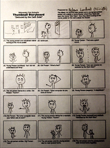
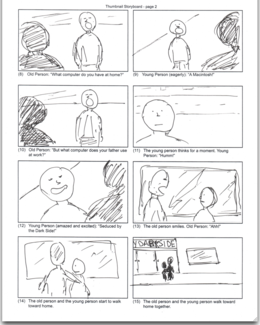
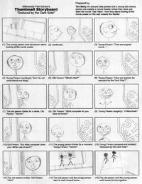
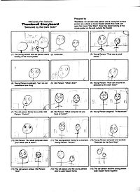
Thumbnail storyboards from the lesson on Thumbnail storyboarding


Click on the image to see larger version.

Kasturika has completed this assignment (pdf) (23 May 2007) Good job! 10 points

Kasturika says, "I used the Microsoft paint application.

I took a screen shot of the storyboard, converted it into bitmap image, made the frames separately and pasted them.

Then I used OpenOffice.org Draw to export the bitmap image as PDF."


assignment
Click on the image to see larger version.

Niri0n in Sweden has completed this assignment (png). Click on the image to see larger version. (23 May 2007) Good job! 10 points


assignment
Click on the image to see larger version.

Wachapon2 has completed this assignment (png). Click on the image to see larger version. (2 June 2007) Good job! 10 points


assignment
Click on the image to see larger version.

Tunderboy9 has completed this assignment. (13 July 2007) Good job! 10 points


Click on the image to see larger version.
Vijay Singh has completed this assignment. (17 July 2007) Good job! 10 points


This is the first storyboard which looks like a movie.

The figures are positioned as in a movie. The size of the figures are as in a movie.

Yet, these are still very simple thumbnail storyboards. Please look at these storyboards!!!!


Click on the image to see larger version.
Mok has completed this assignment. (21 July 2007) Very good job! 10 points


Here is a very artistic thumbnail storyboard.

Click on the image to see larger version.
Fred has completed this assignment. (5 August 2007) Very good job! 10 points

assignment
Click on the image to see larger version.

Mpftmead has completed this assignment (png). Click on the image to see larger version. (6 August 2007) 10 points


Click on the image to see larger version.
Izwah has completed this assignment. (6 August 2007) 10 points

assignment
Click on the image to see larger version.

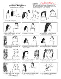
Refardeon has completed this assignment (png). Click on the image to see larger version. (13 August 2007) 10 points


assignment
Click on the image to see larger version.

Noblerinthemind has completed this assignment using GIMP (png). Click on the image to see larger version. (16 August 2007) 10 points


Click on the image to see larger version.

KinnetiK has completed this assignment (JPG). Click on the image to see larger version. (23 August 2007) 10 points


Click on the image to see larger version.

Sushant has completed this assignment (JPG). Click on the image to see larger version. (01 September 2007) 10 points


Click on the image to see larger version.

Tharun Bhascker has completed this assignment (JPG). Click on the image to see larger version. (5 September 2007) 10 points


Click on the image to see larger version.

Moraistelmo has completed this assignment (JPG). Click on the image to see larger version. (7 September 2007) 10 points


Click on the image to see larger version.

Elisia Johnson has completed this assignment (PNG). Click on the image to see larger version. (01 October 2007) 10 points


Click on the image to see larger version.
Sibte Hassan has completed this assignment. (6 October 2007) 10 points


Click on the image to see larger version.
Mattjames17 has completed this assignment. (30 October 2007) 10 points


Click on the image to see larger version.
Cristiana has completed this assignment. (08 November 2007) 10 points


Click on the image to see larger version.
William Lewis has completed this assignment. (13 November 2007) 10 points


Click on the image to see larger version.

Manuelciosici has completed this assignment. (05 December 2007) 10 points


Click on the image to see larger version.

Pruthvirajg has completed this assignment. (10 December 2007) 10 points


Click on the image to see larger version.

Davidmp4 has completed this assignment. (21 December 2007) 7 points


Click on the image to see larger version.
Alideniz has completed this assignment. (01 January 2008) 10 points


Click on the image to see larger version.
Sereyaco has completed this assignment. (03 January 2008) 10 points


Click on the image to see larger version.

Marcus Mac has completed this assignment. (28 January 2008) 10 points


Click on the image to see larger version.

Mike305 has completed this assignment. (01 March 2008) 10 points


Click on the image to see larger version.

Vikram_Acharya has completed this assignment. (30 March 2008) 10 points


Click on the image to see larger version.

Eldorino has completed this assignment. (05 April 2008) 10 points


Completed assignment - Creating the thumbnail storyboard

June 12, 2008 -- Rick14 has created a thumbnail storyboard.


Click on the image to see larger version.


Filmmaking:3D Storyboarding:over the shoulder shots:completed assignments

Completed assignment - Over-the-shoulder shot created with FrameForge Studio for the Lessons on 3D Storyboard
Kasturika has finished the assignment - 10 June 2007 - 6 points.


Click to see larger image.
Elisia Johnson submitted her assignment 2007-10-01 - 4 points
Elisia Johnson submitted this for her assignment. - 10 June 2007 - 6 points.

Click to see larger image.


The Instructor's Correction image.
Matt submitted this assignment 2007-10-30 - 4 points
Here are the original shots.

Telephoto

Wide Angle shot
Here are the corrections.

Telephoto

Wide Angle
Red Prince submitted this assignment 2007-10-31 - 4 points
Here are his shots.

Wide Angle

Telephoto shot
Manuelciosici submitted this assignment 2007-12-08 - 4 points
Here are his shots.

Telephoto shot

Wide angle


Here is the instructor's correction for the wide angle shot.


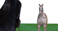
Note: The instructor did NOT move the horses.
Only the was camera moved for this shot.
The camera rotated, dollied, and tilted to get this shot.

Corrected wide angle


pruthvirajg submitted this assignment 2007-12-14 - 4 points
Here are his shots.

Telephoto shot

Wide angle


Instructor's corrections
Note: First, I put the horses in a straight line.
Then I moved the camera for this shot.
The camera was rotated, dollied, and tilted to get these shot.

Corrected telephoto shot

I raised camera and then tilted it down.
I moved the camera closer.

Corrected wide angle
I changed the zoom to 75 degrees which is a wide angle lens. For this assignment, I need you to create a very wide look that is why I ask for a 74 degree view. For this shot, I added depth of field. I also tilted the camera slightly.


Alideniz submitted this assignment 2008-01-03 - 4 points


Instructor's corrections
Note:Alideniz used FrameForge 3D Studio v1.
I used version 2.
I think that the heads should look the same height.

Corrected telephoto shot

For the wide angle, I moved the actors closer together. For the telephoto, I moved the actors apart. This way, the actors appear the same size but with a totally different look.


Completed assignment - Creating an over-the-shoulder shot

June 15, 2008 -- JoshLobel has created a wide angle over-the-shoulder shot and a telephoto over-the-shoulder shot.

Here are the original shots.

Telephoto

Wide Angle shot
Here are possible corrections.

Telephoto

Wide Angle shot


Filmmaking:3D Storyboarding:completed assignments

Created with FrameForge 3D Studio


Completed assignment

Kasturika

3D Storyboards from FrameForge 3D Studio Free demo version


Click on a picture to see a larger version of the picture.
Then click on the words Full resolution see full size.
Finally, download the full size version to your hard drive to begin creating an animatic which is a movie of the storyboards.


Completed assignment

Tunderboy9

3D Storyboards from FrameForge 3D Studio Free demo version


Click on a picture to see a larger version of the picture.
Then click on the words Full resolution see full size.
Finally, download the full size version to your hard drive to begin creating an animatic which is a movie of the storyboards.


Completed assignment

KinnetiK

3D Storyboards from FrameForge 3D Studio Free demo version


Click on a picture to see a larger version of the picture.
Then click on the words Full resolution see full size.
Finally, download the full size version to your hard drive to begin creating an animatic which is a movie of the storyboards.


Completed assignment

Sir Mok

3D Storyboards from FrameForge 3D Studio Free demo version

Sir Mok has finished the assignment - 30 April 2007 - 6 points

Teachers corrections


Click on a picture to see a larger version of the picture.
Then click on the words Full resolution see full size.
Finally, download the full size version to your hard drive to begin creating an animatic which is a movie of the storyboards.


You can see Mohamed's animatic movie (with instructor's corrections) at Mohamed's Animatic. (This file requires the ability to play OGG movies on your computer. Updated March 8: 1.7MB, 1 minute 13 seconds, stereo, 320x240 letterboxed with subtitles)


Completed assignment

Moraistelmo

3D Storyboards from FrameForge 3D Studio Free demo version
Teacher's Corrections


Completed assignment

Izwah

3D Storyboards from FrameForge 3D Studio Free demo version
  • Izwah has finished the assignment - 14 July 2007 - 6 points.


Click on a picture to see a larger version of the picture.
Then click on the words Full resolution see full size.
Finally, download the full size version to your hard drive to begin creating an animatic which is a movie of the storyboards.


Completed assignment

Manuelciosici

3D Storyboards from FrameForge 3D Studio Free demo version


Here are the instructor's suggestions.


Click on a picture to see a larger version of the picture.
Then click on the words Full resolution see full size.
Finally, download the full size version to your hard drive to begin creating an animatic which is a movie of the storyboards.


Completed assignment

Prithvirajg

3D Storyboards from FrameForge 3D Studio Free demo version


Here are the instructor's suggestions.


Click on a picture to see a larger version of the picture.
Then click on the words Full resolution see full size.
Finally, download the full size version to your hard drive to begin creating an animatic which is a movie of the storyboards.


Completed assignment

Eldorino

3D Storyboards from FrameForge 3D Studio Free demo version


Note: Eldorino, please use the last image for the matte painting


Click on a picture to see a larger version of the picture.
Then click on the words Full resolution see full size.
Finally, download the full size version to your hard drive to begin creating an animatic which is a movie of the storyboards.


Filmmaking:3D Storyboarding:completed assignments:individual frames

Here are the individual storyboards for Kasturika. Click on the picture to see a larger image and then click on the words "Full resolution" to see the full-size clip which you can download to your computer ready for editing.

1. 2. 3. 4. 5. 6. 7. 8. 9. 10. 11. 12. 13. 14. 15.


Here are the individual storyboards for Sir Mok. Click on the picture to see a larger image and then click on the words "Full resolution" to see the full-size PAL Wide-screen 1.85 clip which you can download to your computer ready for editing.

1. 2. 3a. 3b. 4. 5. 6. 7. 8. 9. 10. 11. 12. 13. 14. 15.


Film School:Animatic Dialog Recording:Completed Assignments

Homework
Homework
(1) Young Person: "That was a great movie..."
(2) Young Person (contined): "but I do not understand one thing."
(3) Old Person: "What's that?"
(4) Young Person: "How can anyone be seduced by the Dark Side?"
(5) Old Person: "Hummm"
(6) Old Person: "What computer do you have at home?"
(7) Young Person (eagerly): "A Macintosh!"
(8) Old Person: "But what computer does your father use at work?"
(9) Young Person "Hummm"
(10) Young Person (amazed and excited): "Seduced by the Dark Side!"
(11) Old Person: "Ahhh!"
Fat Penguinsays, "I used the basic microphone on my personal computer and a free application called Goldwave. I used noise reduction effect and changed the pitch. The software can be found on www.goldwave.com.


Click on the dialog to hear the sound.


(1) Young Person: "That was a great movie..."
(2) Young Person (contined): "but I do not understand one thing."
(3) Old Person: "What's that?"
(4) Young Person: "How can anyone be seduced by the Dark Side?"
(5) Old Person: "Hummm"
(6) Old Person: "What computer do you have at home?"
(7) Young Person (eagerly): "A Macintosh!"
(8) Old Person: "But what computer does your father use at work?"
(9) Young Person "Hummm"
(10) Young Person (amazed and excited): "Seduced by the Dark Side!"
(11) Old Person: "Ahhh!"
Kasturika completed the assignment at home in New Delhi, India.


Click on the dialog to hear the sound.


(1) Young Person: "That was a great movie..."
(2) Young Person (contined): "but I do not understand one thing."
(3) Old Person: "What's that?"
(4) Young Person: "How can anyone be seduced by the Dark Side?"
(5) Old Person: "Hummm"
(6) Old Person: "What computer do you have at home?"
(7) Young Person (eagerly): "A Macintosh!"
(8) Old Person: "But what computer does your father use at work?"
(9) Young Person "Hummm"
(10) Young Person (amazed and excited): "Seduced by the Dark Side!"
(11) Old Person: "Ahhh!"
Tunderboy9 completed the assignment at home island of Aruba, Netherlands.


Click on the dialog to hear the sound.


(1) Young Person: "That was a great movie..."
(2) Young Person (contined): "but I do not understand one thing."
(3) Old Person: "What's that?"
(4) Young Person: "How can anyone be seduced by the Dark Side?"
(5) Old Person: "Hummm"
(6) Old Person: "What computer do you have at home?"
(7) Young Person (eagerly): "A Macintosh!"
(8) Old Person: "But what computer does your father use at work?"
(9) Young Person "Hummm"
(10) Young Person (amazed and excited): "Seduced by the Dark Side!"
(11) Old Person: "Ahhh!"
Sir Mok completed the assignment at home in Cairo, Egypt.


Click on the dialog to hear the sound.


(1) Young Person: "That was a great movie..."
(2) Young Person (contined): "but I do not understand one thing."
(3) Old Person: "What's that?"
(4) Young Person: "How can anyone be seduced by the Dark Side?"
(5) Old Person: "Hummm"
(6) Old Person: "What computer do you have at home?"
(7) Young Person (eagerly): "A Macintosh!"
(8) Old Person: "But what computer does your father use at work?"
(9) Young Person "Hummm"
(10) Young Person (amazed and excited): "Seduced by the Dark Side!"
(11) Old Person: "Ahhh!"
Moraistelmo recorded them at home, in Newark, New Jersey, USA.

Click on the dialog to hear the sound.


(1) Young Person: "That was a great movie..."
(2) Young Person (contined): "but I do not understand one thing."
(3) Old Person: "What's that?"
(4) Young Person: "How can anyone be seduced by the Dark Side?"
(5) Old Person: "Hummm"
(6) Old Person: "What computer do you have at home?"
(7) Young Person (eagerly): "A Macintosh!"
(8) Old Person: "But what computer does your father use at work?"
(9) Young Person "Hummm"
(10) Young Person (amazed and excited): "Seduced by the Dark Side!"
(11) Old Person: "Ahhh!"
Sushant recorded them at home, in Hyderbad, India.

Click on the dialog to hear the sound.


(1) Young Person: "That was a great movie..."
(2) Young Person (contined): "but I do not understand one thing."
(3) Old Person: "What's that?"
(4) Young Person: "How can anyone be seduced by the Dark Side?"
(5) Old Person: "Hummm"
(6) Old Person: "What computer do you have at home?"
(7) Young Person (eagerly): "A Macintosh!"
(8) Old Person: "But what computer does your father use at work?"
(9) Young Person "Hummm"
(10) Young Person (amazed and excited): "Seduced by the Dark Side!"
(11) Old Person: "Ahhh!"
Pruthvirajg recorded them at home, in Scuderbad, India.

Click on the dialog to hear the sound.


For help playing OGG files, go to Commons:Media help or to Wikipedia:Media help (Ogg)


Film School:Creating The Movie Poster:Completed Assignments

Homework
Homework
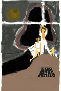
Movie posters from the lesson on creating the movie props


Tunderboy9 has completed this assignment (pdf) (16 July 2007) 30 points


Tharun Bhascker has completed this assignment (pdf) (5 September 2007) 30 points


Sir Mok has completed this assignment (pdf) (12 October 2007) Note: In many countries, movie posters are wider than tall. This poster is from Egypt.
The text means "Star Wars", and it’s pronounced “Harb El Nojoom” in Arabic language. And in Egyptian accent, it is pronounced as “Harb El Nogoom”, the “G” as in “Game”. 30 points


Template:Film School:Creating The Matte Painting:Completed Assignments

Homework
Homework
Matte paintings from these images

Create matte painting from your last storyboard frame or from these images


"Seduced by the Dark Side!"

Here are some of the starter frames for the matte painting. Remember: Once the movie is finished, the movie clip replaces the starter page. The movie will be composited into the matte painting, camera movement will be added and the resulting movie clip added to the scene.


"Out for a Walk"

Here is the starter frame for the matte painting. Remember: Once the movie is finished, the movie clip replaces the starter page. The movie will be composited into the matte painting, camera movement will be added and the resulting movie clip added to the scene.


As you look at the completed matte paintings below, can you see the original starter frame?
Matte painting for "Seduced by the Dark Side" from Aruba

Tunderboy9 has completed this assignment (png) (1 October 2007) Good job! 30 points

Matte painting for "Out for a Walk" from Aruba

Tunderboy9 has completed this assignment (png) (10 October 2007) Good job! 30 points

Matte painting for "Seduced by the Dark Side" from Egypt

Sir Mok has completed this assignment (png) - (01 December 2007) Good job! 30 points

Click on the image to see the full sized image.

Sir Mok says,

I have tried my best to make it Egyptian characterized. In Egypt, cinemas are found between buildings, you can find lots of buildings and shops are surrounding it. So I had to put so many buildings in the picture, meanwhile, I was interested in showing the sun rise.


Template:Film School:Creating The Matte Painting 1:Completed Assignments

Homework
Homework


Tunderboy9 has completed this assignment (png) (1 October 2007) Good job! 30 points


Template:Film School:Creating The Matte Painting 2:Completed Assignments

Homework
Homework


Tunderboy9 has completed this assignment (png) (10 October 2007) Good job! 30 points


Template:Film School:Creating The Matte Painting 3:Completed Assignments

Homework
Homework


Sir Mok has completed this assignment (png) - (01 December 2007) Good job! 30 points

Click on the image to see the full sized image.

Sir Mok says,

I have tried my best to make it Egyptian characterized. In Egypt, cinemas are found between buildings, you can find lots of buildings and shops are surrounding it. So I had to put so many buildings in the picture, meanwhile, I was interested in showing the sun rise.


Film School:Music Cue 2:Completed Assignments

Completed Homework Assignments - Music Cue #2
Homework
Homework
Film score music example for Film Scoring:Graduation Day:Music Cue 2
  • Eze has completed this assignment.. (2007-05-27)
From Spain, he sent me a project file from Apple's GarageBand designed to work with the musical instruments of Apple's Jam Pack:Symphony Orchestra. I converted this to an OGG file which you can hear by clicking here. 20 points. Thank you for being the first to complete this assignment.


Film School:All about lenses:Pop Quiz 1:Completed answers

Answers for the pop quiz on for the Camera lenses #1
Pop Quiz
Pop Quiz
  • Jolon has completed this pop quiz - 31 May 2007 - 2 points

Wide Angle
·

Telephoto
I feel warmth and closeness to the subject. There is an emphasis on the face which produces a more intimate ambience.


Wide Angle
I really notice the distortion caused by the wide-angle lense. I feel alienated from Curious Young Person almost as if she were pressing her face against a window and mugging at me. Don't you make monkey-shines at me young lady!
·

Telephoto
I feel neutral about the character in this frame. I can't tell whether this shot is meant to imitate a 'normal' lens or a 'moderate telephoto' lens, but the character's featrures are no longer distorted. A big smile would make me feel warmly toward her.


Wide Angle
The first image appears very close (may be even too close for comfort, which may make the person look intimidating) while the second one is at a comfortable distance. The first image also seems to have a bigger smile as compared to the second. This bigger smile in a way also conveys more curiosity than the second frame which has a relatively indifferent expression.
·

Telephoto
The shoulders of the first frame seem narrower than those of the second frame(almost as if the entire frame were compressed). This gives the feeling that the person is being viewed from a slightly higher level than the eye-level of the young person. This adds to the feeling of curiosity.


Wide Angle
A more focused look in relation to the second photo.
·

Telephoto
A more zoned out feel in relation to the 1st photo.


Wide Angle
Well the first photo with that shot, looks more close, intimate, and warmer, like your talking to her.
·

Telephoto
The second is more away, kind of cold, like she's thinking or isn't in a conversation.


  • Izwah has completed this pop quiz - 12 August 2007 - 2 points

Wide Angle
The girl looks both curious and excited for something. Whom ever being stared like this would feel like at the center stage for having something wanted by the girl. At one point this shot would set some kind of pressure to viewers - feeling little bit of uneasy/tense perhaps.
·

Telephoto
Unlike the first shot, this one is more neutral and calm. Her facial profile is more warmth. No tension created by the shot/lenses, I am feeling at ease.


Wide Angle
The thing is that the first picture makes me feel, while the second one is very empty to me. In the first image the person's face is refracted to seem closer to the screen and to the eye. This things offers closure to the image.It may seem strange, but the face looks kinda freaky!
·

Telephoto
The second image is purely neutral to me. I cannot feel a thing coming from that image. The lenses went to neutral I think.


Wide Angle
The wide angle shot gives a comical point of view .. the subject seems to be closer and distorted whereas in a telephoto shot the subject looks a lot like in normal life , a normal human eye perception it gives a sense of reality.
·

Telephoto


  • Sushant has completed this pop quiz - 5 September 2007 - 2 points

Wide Angle
The second picture is a little more mundane and boring than the first one. I'm not sure what exactly the mood is, but the first one in my opinion is more positive than the second one.
·

Telephoto


Wide Angle
I feel a more comfortable mood.
·

Telephoto
A feel a more boring mood.


Wide Angle
In the first image the mood I feel is warm and happy but in the second image it feels a bit cold and unfriendly.
·

Telephoto


Wide Angle
The angle of this one (wide angle) makes me feel uneasy and uncomfortable.
·

Telephoto
While as the second one as a more friendlier feel; the shot breathes more life into what the shot is telling.
  • Razie92 has completed this pop quiz - 07 November 2007 - 2 points

Wide Angle
I feel quite happy.
·

Telephoto
I feel boring.


Film School:All about lenses:Pop Quiz 2:Completed answers

Pop Quiz
Pop Quiz
  • Jolon says "Do all three if necessary." - 30 May 2007 - 2 points

  • Disilver says "Move the actors. We can back them up a few feet and use a normal, or maybe mild telephoto, lens to get the close up we want. We should still have the background information that we want in the shot. That is - enough to place the audience on the walk in front of the theater." - 31 May 2007 - 2 points

  • Kasturika says "The movie set cannot be moved (at least not easily in practice). So the characters should be moved. The old person can be pushed back some distance, but there is a possibility that the sequence of shots will not look continuous.
If a camera is placed between the two characters then to give a little breathing space, the lens can be changed to a wider angle.
One can also take an over-the-shoulder-shot without bringing the old person within the frame by taking the camera away and changing its focal length at the same time. " - 19 June 2007 - 2 points

  • Izwah says "Just do whatever it takes to get the most appropriate shot. If nothing else is possible to be done on the current set - then simply 'cheat' it." - 12 August 2007 - 2 points

  • KinnetiK says "I would have to say my answers are 2. and 3.
I would move the actors slightly and change the lens type to create a warmer environment and to mask the fact that the actors were moved. I would also change the angle of the shot (and make that a very short scene:) )." - 27 August 2007 - 2 points


Film School:Moods:Pop Quiz:Answers

Answers to the Pop Quiz on the moods for the opening of the scene.
Pop Quiz
Pop Quiz
What are the first and the second moods of the movie?
Before each student starts creating the animatic, the student must decide on the moods (and therefore, the music) which must be included in the movie.
Here are the answers from the students.


Tunderboy9 says:
First mood: Mystery.ogg
I want the answer to be Mystery to let the audience know that something is wrong (the boy needs to ask something, he is confused).
Second mood: Bold.ogg
I will say that the second sound will be Bold so the people to know that this is an important part of the clip. - 4 points - November 1, 2007.


Sir Mok says:
First mood: Awakening.ogg
“Awakening” as a first mood, that the movie starts with.
It conveys the feel of the start, like something is about to begin. It’s also a peaceful music, and that’s compliant the theme and pace of movie, plus there are no tensions or suspense in the scene.
Second mood: Bold 2.ogg
“Bold_2” as a second mode.
This musical mood supports the story, which is around “Star Wars” movie. - 4 points - December 1, 2007.


Homework and Pop Quizzes: Film Editing

Film Scoring
Below are all the completed assignments in the Film Editing course for filmmakers by Wikiversity Film Students.


Homework and Pop Quizzes: Film Scoring for Musicians

Film Scoring for Musicians
Below are all the completed assignments in the Film Scoring course for musicians by Wikiversity Film Students.

Film Scoring for Musicians:Sound of Fear:Completed Assignments


Simple musical sounds which create the mood of fear


  • Tiego Louis Zontag (Zon) has created the sound of fear using Protools and Miroslav plugin. Zon says, "In Miroslav, the trills violins not exceed 3 or 4 seconds. So, I use trem violins." - 13 December 2007 - 10 points - - - Most interesting sound of fear yet!!!!
I used Logic Pro, and Miroslav strings. The strings did not last six seconds, so I layered them. I allowed a bit of space at the end for the reverb to die away.
I used track automation to provide a gentle volume slide into the sound, and panned the violins into their correct orchestral position. I used a long tunnel reverb to make the violins sound so scary. - 23 February 2008 - 10 points
May 15, 2008
Tonto Silver has created the sound of fear.
Tonto Silver says, "I have created fear with Protools using structure sampler. One note sudden then fade then swell then fade out. The strings tremelo 1 from garageband orchestra loaded into structure. I added medium hall reverb with TL space plug in. using GarageBand with Jam Pack Symphony Orchestra."


Film Scoring for Musicians:Other simple sounds:Completed Assignments

Examples of moods from single notes or chords for the course on film scoring for musicians


  • From Mannheim, Germany, Rainer Pusch has completed this assignment. (2007-06-03)
Sad - 2 points.
Tired - 2 points.
Surprise 1 - 2 points.
Surprise 2 - 2 points.


  • From Sofia, Bulgaria, Stanov has completed this assignment. June 5, 2007
Sad - 2 points.
Tired - 2 points.
Surprised - 2 points.


Sad - 2 points.
Tired - 2 points.
Surprised - 2 points.


  • Orsanct has has created this assignment. July 20, 2007 -- Instructor Note: This is the first person to get the assignment correct. Notice that this is extremely difficult to do.
Sad - 10 points.
SurpriseShock - 10 points.
Tired - 10 points.


  • Blueygh2 has created this assignment using Sibelius 4 using Garritan Personal Orchestra sound library. August 23, 2007
Sad - 10 points.
Surprise - 10 points.
Tired - 10 points.


  • TBOL3 has created this assignment. August 24, 2007
Sad - 10 points.
Surprise - 10 points.
Tired - 10 points.


  • FIREborn has created this assignment. November 05, 2007 - These are the best so far!!!!
Sad - 10 points.
Surprise - 10 points.
Tired - 10 points.


  • Sowens has created this assignment. November 07, 2007
Sad - 10 points.
Surprise - 10 points.
Tired - 1 points.


Sad - 10 points.
Surprise - 10 points.
Tired - 10 points.


  • Robert Hall has created this assignment. February 14, 2008
Sad - 10 points.
Surprise - 10 points.
Tired - 10 points.


Sadness - 10 points.
Cubinoid has created the sound of sadness using one note.
I used Logic Pro, and Miroslav strings.
I allowed a bit of space at the end for the reverb to die away.
I used track automation to provide a gentle volume slide into the sound, and panned the cellos into their correct orchestral position. I used a Roman Cathedral reverb to make the cellos sound spacious and empty.
Surprise - 10 points.
Cubinoid has created the sound of surprise using one note.
I used Logic Pro, and VSL.
I allowed a bit of space at the end for the reverb to die away.
I used track automation to provide a steep volume slide into the sound, and panned the horns into their correct orchestral position. I used a museum reverb to make the horns sound close and echoey
Tiredness - 10 points.
Cubinoid has created the sound of tiredness using one note.
I used Logic Pro, and VSL.
I allowed a bit of space at the end for the reverb to die away.
I used track automation to provide a volume slide into the sound, and to provide a slow rhythmic feel to the note, and panned the tubas into their correct orchestral position. I used a longish reverb to make the horns sound weary and dreamlike.


Sad - 10 points.
Surprise - 10 points.
Tired - 10 points.
May 15, 2008
Sad - 10 points.
Magic - 10 points.
Tired and Lazy - 10 points.


Film Scoring for Musicians:Sound of Joy:Completed Assignments


Examples of delicate rhythms sounds which create a mood for the course on film scoring for musicians


From Mannheim, Germany, Rainer Pusch sent me an MP3 file for the sound of joy (actually, "Joy, but danger gets closer...") I converted the file to OGG which you can hear by clicking here. 2 points.


  • Stanov has completed this assignment. June 6, 2007
From Sofia, Bulgaria, Stanov sent me an MP3 file for the sound of joy. I converted the file to OGG which you can hear by clicking here. 2 points.


  • Orsanct has completed this assignment. July 22, 2007
From Oregon, Orsanct sent me an MP3 file for the sound of joy. I converted the file to OGG which you can hear by clicking here. 10 points.


  • TBOL3 has completed this assignment. August 26, 2007
Created in Rosegarden and TiMidity++ clicking here to listen. 10 points.


  • Blueygh2 has completed this assignment. September 3, 2007
The sound of happy was created in Sibelius 4 using Garritan Personal Orchestra sound library. clicking here to listen. 10 points.


  • Joe Mac has completed this assignment. September 15, 2007
The 6 second sound of joy was created in GarageBand 4 using one instrument (Boldt ensonic glock) 5 notes, played by hand on yamaha midi controller.clicking here to listen. 10 points.


  • FIREborn has completed this assignment. November 05, 2007
The sound of joy was created in Propellerheads Reason 3.0,. Clicking here to listen. 10 points.


  • Sowens has completed this assignment. November 07, 2007
The sound of joy was created using Finale with the Garritan personal orchestra. Clicking here to listen. 10 points.


  • Robert Hall has completed this assignment. February 14, 2008
The sound of joy was created using Sibelius 4. Clicking here to listen. 10 points.


A sound of joy was created using Logic Pro and the Vienna String Library. Clicking here to listen.
Another sound of joy was created using Logic Pro and the Vienna String Library. Clicking here to listen.
Both of these had melodies as well as rhythm. Many times, you do not have the space to include a melody. Therefore, I prefer no melody for this assignment.
Another attempt at the sound of joy was created using Logic Pro and the Vienna String Library. Clicking here to listen. It still has a melody.
Finally a sound of joy was created using Logic Pro and the Vienna String Library which has no melody. Clicking here to listen. 10 points.


May 15, 2008
Joy.


Film Scoring for Musicians:Other simple repeating rhythms:Completed Assignments


Examples of delicate rhythms sounds which create a mood for the course on film scoring for musicians


Orsanct has completed this assignment. July 22, 2007


TBOL3 has completed this assignment. August 27, 2007


Blueygh2 has completed this assignment. September 3, 2007


Joe Mac has completed part of this assignment. This is played by hand on midi controller, using GarageBand synth texture "skye breath." Master setting: ambient basic. September 16, 2007

  • The sound of Falling (leaves in the wind, money out the window, etc.) is a rapidly repeating rhythm which played softly can be placed behind dialog. clicking here to listen. 10 points.


FIREborn has completed part of this assignment using Propellerheads Reason 3.0 - November 05, 2007

  • The sound of Fast like the wind is a rapidly repeating rhythm which played softly can be placed behind dialog. Clicking here to listen. 10 points.
  • The sound of Born in orbit is a rapidly repeating rhythm which played really softly can be placed behind dialog. Clicking here to listen. 10 points.


Sowens has completed part of this assignment using Finale with the Garritan personal orchestra. - November 7, 2007


Tiego Louis Zontag (Zon) has completed part of this assignment using Finale with the Garritan personal orchestra. - December 13, 2007

  • The sound of Picolo Discord is a rapidly repeating rhythm which played really softly can be placed behind dialog. Clicking here to listen. 10 points.


Ben Henderson (Cubinoid) has created the sound of stardust using celesta. - February 23, 2008

I used Logic Pro, and Vienna.
I used track automation to provide a fade into the sound, and out again and panned the celesta from one side to the other. I used a stereo reverb to make the give the sound a chance to appear in a stereo space.


Robert Hall) has completed part of this assignment using Sibelius 4. - March 4, 2008


May 17, 2008
Magic harp.


Mad Max:Narrative Music:Pop Quiz:Answers

Pop Quiz
Pop Quiz


  • Jebatasmara was the first person to complete this assignment. - 5 March 2007 - 4 Points plus 2 extra for being the first.
  1. Two people are join together for a wedding, sounds happy.
  2. Its the time you walk the deadman to the grave... cool.
  3. Its comming..mostly with dark and low it must be the bad guy.
  4. Waiting for dinner during christmas eve?
  5. Very tense and disturb, something like that.
  6. He or she is turning older and wiser, (maybe) happy birthday.
  7. Waiting for something to happen..uprising, fantasies.
  8. Something is funny and comical.


  • Eze has completed this assignment - 30 April 2007 - 4 points
  1. A wedding.
  2. A funeral.
  3. Victory. Helicopters in Vietnam approaching the coast...
  4. Joy.This reminds me of Christmas, snow falling, a small kid selling newspapers in the snow. A sweet smell in the atmosphere.
  5. Hurry. A chase scene, maybe for a comedy.
  6. Someone is getting older this year.
  7. Mystery, suspense. Reminds me of Tchaikovsky.
  8. It is not so clear to me. Someone is going to get chastised?


  1. A room full of people asking each other how long it will last.
  2. ?
  3. Heroic action, idea, entrance
  4. Hallelujah, things are suddenly and unexpectedly looking up. So everyone is elated.
  5. In some form of a rush.
  6. It is someone's birthday. I just discovered the tuba gives me the image of a fat or drunk person for some reason. So a fat drunk person is having a birthday party cramming their face with cake.
  7. Christmas? Something is building in the plot. The movie Home Alone comes to mind for some reason...
  8. Something humorous has just happened. It feels sheepish kind of... Like you would want to say "Oh that (character) he/she is so silly."


  1. There is a (probably traditional) wedding.
  2. Something ominous will happen (although perhaps with a touch of morbid humor).
  3. Something bombastic, triumphant, combative.
  4. Celebrating in a religious (Christian) context.
  5. Frenetic, full of energy, possibly in a struggle.
  6. It's someone's birthday.
  7. Fairytale spookiness, dark charm.
  8. There is a mystery afoot--an event has concluded but some of its implications are ambiguous.


  1. Somebody's gonna get married ...
  2. Somebody's dead
  3. Flying fantasy theme? That Wagner's theme is all flying related as far as I know :-)
  4. Happy :P
  5. Acting like in an animation movie scene ...
  6. Somebody's gotta birthday
  7. Suspense but not in a horror or thriller genre .. more like in a comedy
  8. It's like a scene with a finished act. Somebody tells something to someone else and he thinks about that for a few seconds. Then the scene changes ...


Example 1: While browsing in a small bookstore, our commitment-avoidant male lead notices he is being stared at by a young woman two aisles down. He immediately jumps to conclusions about her intentions. He dives to the floor and begins crawling towards the back door of the shop.
Example 2: While visiting a reputedly haunted house, our hero spots a disturbing music box: instead of a gracefully rotating ballerina atop its ornate cover, he notices a skeleton holding its own grinning skull. He plans his hasty retreat. . .
Example 3: Sorry, all I can think of is mechanical, horn-helmeted Valkyries flying about on carousel horses!
Example 4: Sadness. Perhaps a Christmas spent (unexpectedly) alone. Sniff.
Example 5. Some kind of frenetic activity placed in a surreal setting. (Peewee Herman riding his bike over to his buddy -- Aram Khachaturian's -- house? The grass is blue and the sky is orange.)
Example 6. It's Animal Planet and we're celebrating a hippopotamus's birthday, of course!
Example 7. Stealth. A nocturnal setting. Holiday season. (Perhaps we're sneaking around a toy store at night -- presumably searching for those darn missing Sugar Plum Fairies!)
Example 8. At a formal state ball, everyone is frozen and transfixed as a rather corpulent ghost couple (replete in classical dress, powdered wigs, etc.) complete their dance and mysteriously disappear in a flurry of tiny lights. (Comedic) panic ensues as everyone heads towards the exits.


  • TBOL3 has completed this assignment - August 26 2007 - 4 points
1. Two people will get married
2. Someone has just died.
3. This make me feel "royal".
4. This feels happy.
5. An Indiana Jones type of feeling.
6. It's someone's birthday.
7. A sneaking up sensation.
8. The movie will end an a strange note.


1. Well, Obviously it means Wedding March, or just Wedding
2. That kinda creepy (as if I do care!), that is much like a funeral music. or DEATH.
3. It's like when your in a Arena, or in stadium. It's sound like fight scene or like wrestling! .
4. Calm
5. In the mood of Rush Effect.
6. It's a birthday. well, One Big Happy Birthday
7. Christmas.
8. No IDEA!


1. A marriage is about to happen.
2. Someone died
3. The gladiators enter the arena
4. Peaceful
5. A comic-like chase scene
6. Someone is celebrating birthday
7. Faerielike (Dance of the Sugarfairy?)
8. Someone is having a rather bad surprise


  • Joe Mac has completed part of this assignment - September 15 2007 - 4 points
1. Someone is getting married.
2. There may be or has been a death..........grave or mortal danger is at hand
3. The music heralds some important news or announcement.
4. A joyous occasion
5. Excitement....adventure
6. It's someone's birthday
7. Uplifting........rising expectations (Elation..........like when you're on the way home after spending time with a new girlfriend uplifting a happy realization.)
8. Something miraculous, an extraordinary occurrance.


  • FIREborn has completed part of this assignment - November 5 2007 - 4 points
1. It's a wedding
2. It's a funeral? or a mad scientist of some sort...
3. Battle music. Fanfare
4. Halleluja, however you spell that. Christmasy, too
5. Hurried, comedic, childish, chasing
6. Happy birthday to a fat character
7. Sneaking around during christmas
8. Some sort of comedic resolution, ending


My answers to the Pop Quiz:
1- A happy and usual ceremony of marriage
2- A ceremony of marriage macabre. Something like the marriage of Chuck.
3- Conclusion of a victory.
4- Initially, perhaps because of the time, I remember the Christmas (music in bells). But this is lost in a amnesia or little mental confusion.
5- A quick flight of a flying insect. Also a quick escape of C. Chaplin:)
6- I see a bad child and very fat. All dirty chocolate in your anniversary celebration.
7- Maybe halloween. Also a scene with children and ghosts ... I do not know. Remember also to a drawing of Mickey and Minnie living the story of John and Mary.
8- One end of a happy and humorous animation story.


My answers to the Pop Quiz:
1- The bride is about to enter...
2- There is a slightly comic reference to death...
3- Heroism. Flying. War. Valkyries.
4- Celebrating in a tinkly Christian manner
5- Cancing like crazy in an exotic hectic manner. That is what the music means to me personally - it evokes magic and dangerous excitement.
6- The hippo is having a birthday party
7- Enchantment
8- It is the ending of something - the completion of a circle in a whimsical and slightly comic manner, and the result was unexpected, and slightly disappointing. But it is happy in a tragicomedic way.


My answers to the Pop Quiz:
1- A couple will be traditionally wed at a big church with an organ
2- Impending death...
3- A military fanfare... the cavalry has arrived! Or spitfires...
4- The mood is: celebration time, in church or at winter
5- A comical frenzy - woodblocks sound like ticking clocks - some guy is tidying his messy house before his girlfriends parents arrive
6- Someones birthday, with a stupid or oafish feel because of the tubas - like someone dropped a birthday cake
7- Enchantment
8- Not quite sure, maybe something funny will come to a conclusion - also sounds like fairy dust at the end...


May 17, 2008
My answers to the Pop Quiz:
1. When you hear this, what will happen?
A marriage. The Bride to be walks down the aisle.
2. When you hear this, what will happen?
Someone is dead or dying with a comical twist.
3. What does this feel like?
An announcement is about to happen or perhaps the hero has arrived.
4. What mood is this?
A celebration mood Hallelujah
5. What mood does this music create?
Comically hurrying
6. When you hear this music, what is happening?
A Birthday but comical.
7. What mood does this create? Late at night sneaking possibly
Christmas. A little mysterious.
8. In this scene, what will happen?
The scene is ending but not to the characters liking


Mad Max:Narrative Music:Pop Quiz part 2:Answers

Pop Quiz
Pop Quiz


"I will Choose the Budget to spend in a small amount."


Mad Max:Narrative Music:Pop Quiz:The Spy Story:Answers

Pop Quiz
Pop Quiz


"Who are these guys?"

The problem
When you read the student's answers below, notice how different each one is.
Your audience will feel the same way. Each member of the audience will have very different ideas about who each person is.
The solution
There is only ONE way to make this clear to the audience. That is music.
You must use your music to make this clear. You must tell the audience who these people are. You must guide the audience so they all understand your vision (or the director's vision) for this scene.
Only your music can do this. There is absolutely nothing else which can explain this to the audience.
Therefore, your music is absolutelly vital to the success of this story. It all depends on you.


1. The Lady Spy
The lady spy is anxious to pass on her message so that her colleague can prevent an attack on the city from taking place. Her organization wants to maintain the status quo with a minimum of violence. Most people would laud her goals, so she is good.
2. The Man Spy
The man spy is a colleague of the lady spy. Unlike her, he is calm and collected, but perhaps that's because he is more likely to dismiss the dangers of his profession. He is also working to save the city.
3. The Woman With The Umbrella
The woman with the umbrella is a Frenchwoman whose goal is to assassinate the gentleman spy and prevent him from saving the city. She is also suspicious of the woman with the newspaper and does not hesitate to eliminate her as a potential witness and rival.
4. The Woman With The Newspaper
The woman with the newspaper is a German who intends to intercept the gentleman spy and steal his message. She is another villain, albeit a comical one in her lack of subtlety.


1. The Lady Spy
She was not actually bad. I think she's there just to pass a message. and I think that wasn't so bad.
2. The Man Spy
He is just getting the message to the first lady. I think that he's a good guy. just like the first lady, he is to calm.
3. The Woman With The Umbrella
I think the woman with the umbrella is one of the bad persons in the story.
As I watch the film, on the first scenes, the woman with the umbrella is the partner of the woman with the newspaper. But on the last scene, the that woman finished the woman with the newspaper and worked on her own.
4. The Woman With The Newspaper
She looks like a German to me. and I think she's a spy that was trained to steal. She was one of the Bad persons in the movie.


1. The Lady Spy
The lady spy is a neutral character, she does what she is told to do, without worrying if what she does is good or bad.
2. The Man Spy
The man spy is a mysterious character. He rarely steps out of the darkness.
3. The Woman With The Umbrella
The woman with the umbrella wants to kill the man spy to retrieve the information he received. She's cold hearted and not afraid to eliminate what lies in her way to get what she wants.
4. The Woman With The Newspaper
The woman with the newspaper is a serious woman. She wants to warn the man spy from nearing danger, even though she doesn't get the chance to do so.


  • Joe Mac has completed this assignment - September 18, 2007 - 8 points
1. The Lady Spy
She is worried, concerned......waiting for something/someone. Music is dark, so I think she may be in danger, can't tell if good or bad.
2. The Man Spy
Guy seems anxious, despite the light banter........ All are being watched by an unseen party.
3. The Woman With The Umbrella
Umbrella woman watches and waits, no clue as to nationality, serious characters all.
4. The Woman With The Newspaper
Also watching, trying to appear not to. No clue as to nationality.


1. The Lady Spy
The lady spy is a bad guy. She's dressed in black and is frowning. And she is calm, and confident.


2. The Man Spy
The man spy is the same as her. Both of them are dressed in black and both of them are calm, so they "feel" like bad guys. They have the same attitude, and they are clearly arranging an exchange of some sort, so they both have something to gain, probably.


3. The Woman With The Newspaper
The woman with the newspaper is serious, but overly so, almost to the point of comedy. Overly serious music might further illustrate this. She might be Russian?


4. The Woman With The Umbrella
The woman with the umbrella is bad. She's bad because she knocks out the other spy without a clear motive. We can't tell whether she is working with the man or is also trying to get something from him. I feel like she maybe double-crossed the other female spy, double agent style.


1. The Lady Spy
The lady spy is good and calm. She back with an important document of war should be protected from bad agents.
2. The Man Spy
The man spy is a good agent and calm too. He is an agent from FBI and he will guard and protect the document.
3. The Woman With The Newspaper
The woman with the newspaper is an bad russian agent that need retrieve the documents to your country.
4. The Woman With The Umbrella
The woman with the umbrella is a good french agent help the FBI on capture of the files. She ever help the FBI agent.


1. The Lady Spy
The lady spy is waiting at an agreed time and place and has to pass a message on to the man spy.
She seems to be fairly calm, and neutral.
2. The Man Spy
The man spy... there is a sinister presence about him - he could be a hitman.
I think he might be a bad man!
Perhaps the message passed on contains the name of the next job...
3. The Woman With The Newspaper
The woman with the newspaper is a German, not a great spy. Slightly comical and inept. A litter bug.
She looks like she is attempting to track the hitman spy and get the information he has, or interfere in some way.
I think she is bad.
4. The Woman With The Umbrella
The woman with the umbrella is French. She is in love with the hitman spy, and trying to protect the hitman for some reason...maybe she has a liking for people with umbrellas?
I think she is the good character in this film.


Mad Max:Narrative Music:George Lucas In Love:Answers

Pop Quiz
Pop Quiz


1. The best example of musical continuity?
The best example of continuity is the love theme.
2. The music during the scene with George's teacher?
There is no music at all playing during his dialogue.
3. Is this the Star Wars theme?
The theme is just a sound-alike of the original Star Wars theme. It sounds less epic, yet keeps enough elements of the original piece to keep it recognizable while being different.
4. Who is in control of the music?
The sound mixer guy turned the music down.


1-Continuity example?
The love theme played in the start of film, in the theater scene and also in the "kiss" scene.
2-The Instructor's music?
No music in the Professor scene.
3-The Star Wars theme?
No. It's like an variation of the original theme.
4-Who is in control?
The music is perfect for me. But when the dialogue start the mixer guy turn down volume and kill the music.


Film Scoring for Musicians:Melody for moods:Completed Assignments


Examples of a melody which create a mood for the course on film scoring for musicians


From Oregon, Orsanct has completed this assignment. July 22, 2007


From Germany, Blueygh2 has completed this assignment. September 6, 2007


Joe Mac has completed this assignment. These pieces are played by hand on midi controller, using GarageBand synth texture "skye breath." Master setting: ambient basic. September 16, 2007


Tiago Louis Zontag (Zon) has completed this assignment. December 27, 2007


May 17, 2008
Reflections.ogg‎ .


Film Scoring for Musicians:Melody for Story:Completed Assignments


Examples of a melody which tell a story for the course on film scoring for musicians


From Oregon, Orsanct has completed this assignment. July 22, 2007


From Germany, Blueygh2 has completed this assignment. September 6, 2007


From Florida, Joe Mac has completed this assignment. September 17, 2007

  • Joe Mac used a melody to create the story of a Wedding/Marriage which you can hear by clicking here. (Wedding/marriage melody: Buscarino nylon string electric guitar into GarageBand 4 played ' live.') 10 points.
  • Joe Mac used a melody to create the story of Christmas which you can hear by clicking here. (Xmas melody: Played midi controller into GarageBand. Used boldt ensonic celeste sound.) 10 points.
  • Joe Mac used a melody to create the story of A pretty girl enters which you can hear by clicking here. (pretty girl enters: fender strat into GarageBand 4 .........New Nashville guitar setting, master track set to 'classical chamber.') 10 points.
Update
I asked Joe Mac to try shorter musical cues and to hold the last note. Here are his results.
  • Joe Mac used a melody to create the story of a Wedding/Marriage which you can hear by clicking here. (Wedding/marriage melody: Buscarino nylon string electric guitar into GarageBand 4 played ' live.')
  • Joe Mac used a melody to create the story of Christmas which you can hear by clicking here. (Xmas melody: Played midi controller into GarageBand. Used boldt ensonic celeste sound.)
  • Joe Mac used a melody to create the story of A pretty girl enters which you can hear by clicking here. (pretty girl enters: fender strat into GarageBand 4 .........New Nashville guitar setting, master track set to 'classical chamber.')
When you listen to these musical cues, they sound strange to end on just a sustained note. But remember that in a movie, there is a lot of action and dialog so this music will fit in perfectly.


From Brazil, Tiago Louis Zontag (Zon) has completed this assignment. December 26, 2007


May 17, 2008
The kings arrival.


Film Scoring for Musicians:Bear Family Motiv:Completed Assignments


  • Orsanct has completed this assignment. July 25, 2007


  • Blueygh2 has completed this assignment. September 6, 2007


  • Joe Mac has completed this assignment. September 19, 2007
Instruments
papabear used boldt double bass hit
mamabear used boldt steinway grand piano
babybear used boldt wooden xylophone
goldilocks used pop flute
All were created with GarageBband 4, Yamaha midi controller, played by hand.


Notice this:
When you listen to these motivs, you know exactly the personality of each of these character. In just a few seconds, everything becomes clear.
Only musical motivs can do this. Absolutely amazing!!!!


Completed Film Scoring assignment - Create a motiv
May 18, 2008


Film Scoring for Musicians:Range of emotions:Completed Assignments


Examples of a musical motiv played in different ways to create a mood for the course on film scoring for musicians


  • Orsanct has completed this assignment. July 25, 2007


  • Blueygh2 has completed this assignment. September 6, 2007


  • Joe Mac has completed this assignment. September 24, 2007


Film Scoring for Musicians:Velocity:Completed Assignments

Film Scoring for Musicians:Only A Dream:Completed Assignments


Examples of musical cues for Only A Dream
for the course on film scoring for musicians


Ben Henderson (Cubinoid) has created the film score for this scene - 15 March 2008 - 10 points

I used Logic Pro, and many orchestral samples.
I added a fade, but normally I would leave this to the Sound Guy!
The piano playing at the end is me playing a piece I wrote for this scene - not a real record! I added vinyl noise to it to in order to make it sound somehow wistful and nostalgic. I sampled an actual piano - and created an EXS24 instrument with the samples. It's not the greatest piano in the world, but it has a bit of character!


Tiego Louis Zontag has created the film score . - 15 March 2008 - 10 points


Film Scoring for Musicians:Home Wrecker:Completed Assignments


Examples of musical cues for Home Wrecker for the course on film scoring for musicians

Joe Mac has created two musical cues using a Midi controller and GarageBand 4 - 05 October 2007 - 20 points


Blue Gordon has created the film score using Sibelius 4, using the Garritan Personal Orchestra sound library. - 05 December 2007 - 20 points

Blue Gordon says, "Scoring this scene was challenging and hard. I thought, scoring for film would be easier, but it's hard to find something that fits the film and make the music into something coherent, which in "Home Wrecker", I haven't fully managed to do. To be honest, I don't feel like scoring another scene, after seeing how difficult it was to score "Home Wrecker"...


Ben Henderson (Cubinoid) has created the film score for "Home Wrecker". - 05 December 2007 - 20 points

Cubinoid has also created the two cues for Home Wrecker.
I used Logic Pro and lots of orchestral samples.
The opening cue resembles a pastoral symphony - in contrast to the desolation of the scenery, but it aims to provide a "Dawn" image, yet with underlying unease. The unease turns to tension when the feet come into view - is that a dead body we see?
Alarm bells start ringing and the melodramatic horns signal the start of something happening.
The final cue is a parody of a song voted the second sexiest song of all time - "Closer" by Nine Inch Nails. In the complete version, I added a tambourine because during writing the score, it became an type of leitmotif instrument that represented the baddy/boyfriend - it has references to the tail rattle of a snake, traditionally the symbol for the devil and temptation within Christian culture, and simultaneously it is a reference to early Pagan and Montagnais spiritual music, that was originally played on tambourine, and I used this as a reference to the animism and spiritualism of those cultures. I like the fact that this dualism represents a character that is inherently bad and yet a boyfriend as well.


      • Instructor's note: The first cue is extremely good. It works well with the scene.


Film Scoring for Musicians:Green Tea Smoothie:Completed Assignments


The moods of the scene Green Tea Smoothie.

Joe Mac lists the moods of these scenes - 27 October 2007 - 20 points

Joe Mac roughed out the score in just two hours. The cues are stored here in the OGG file. Remember to start you cues at the beginning of the film scoring project movie so syncing them to the movie is easy.
I'm looking at it right now...........if i get to decide what the prevailing mood of a scene is, rather than taking direction on this........... i'd like to know more of the story than the scenes reveal to me. Since it's not my movie, some guesswork would, it seems to me, be involved. Having said this;
  • Cue #1 (Click here to listen to the cue) - the opening...cue one: .......assistant is happily making the main event, so i'm thinking uplifting, even majestic, orchestral background music to the creation of the drink.
  • Cue #2 (Click here to listen to the cue) - the host rushes in, admiring look on assistant's face as she gives him the drink.....no music. when he says 'now all i need's a straw,' cue two: something troubling sounding, trailing off..... this so we know there is a problem if there are no straws.........
  • Cue #3 (Click here to listen to the cue) - host brings drink to guest in sitting room, presents it apologizing for there being no straws available. Guest takes drink, looks it over, and opens his briefcase, to obtain a fancy, and unusual looking plastic straw. cue three : (Gong rings as he places it in drink............... oriental music in background as he begins to sip.)
  • Cue #4 (Click here to listen to the cue) - host is so surprised by this move, he wonders aloud if this is really the guy he is supposed to meet...........when guest challenges him asking if passport should be shown, cue four: same theme used when straw was asked for by the host in the kitchen (cue two)


Homework and Pop Quizzes: Script Writing

Script Writing
Below are all the completed assignments in the Script Writing for High School Drama Departments course by Wikiversity Film Students.

Film School:Script Writing Course:Completed Assignments

Homework
Homework


This is a six-minute motion picture script for high school drama departments to film using the same stage set, lights, costumes and props as Shakespeare's Romeo and Juliet.


Juliet without Romeo (pdf) was written by Robert Purser. This script is public domain and can be used by high schools for creating a short motion picture to supplement their stage production of Romeo and Juliet. (10 August 2007) 15 points.


Instructor's notes:
This script is slightly moronic, lewd, and crude therefore kids will enjoy it.


Homework and Pop Quizzes: Film Editing

Film Editing
Below are all the completed assignments in the film editing course by Wikiversity Film Students.

Film School:Film Editing:Pop Quiz 1:Completed Assignments


The answers for the Pop Quiz on Follow Dave in the film editing lessons


  • Farmerwal says, "There were 4 setups. The total number of takes is 13." - August 23, 2007 - 4 points


Film School:Penny and Eggbert:Pop Quiz 1:Completed Assignments

Penny and Eggbert - Completed Assignments - The pop quiz for camera setups
Homework
Homework
The camera setups for on "Penny and Eggbert"


1. Wide-angle two shot

2. Telephoto two shot

6. Close-up Shot

8. Over-the-shoulder shot

4. Over-the-shoulder shot

3. Distant telephoto


Laihy says:
I like to answer to the Penny and Egg Pop Quiz #1. My camera angle selection will be:
-No.2 for the general idea of the two personages
-No.6 for Eggbert's speaking to introduce the first character
-No.8 for Penny's speaking, including Eggbert's back, character already introduced
-No.4 for the next conversation
-No.3 a distance view, preparing for fading out.
16 July 2007 - 4 points