This school is:
Narrative film production - Wikiversity Film School
This course is:
The basics of narrative filmmaking


This is an important pop quiz:
  • What is your first frame? Why? - 2 points
  • What is your second frame for this movie? - 2 points


Please take this pop quiz!

What is your first and second shots?

Read the beginning of the story on the right.

Then decide what is the first shot for this movie. Very briefly, please explain why. And finally, please tell me what is your second shot for this movie?

Select from the pictures below or create your own.


The beginning of our story

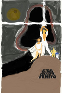
An old and wise person and a young but curious person are outside a movie theater where they have just seen the movie "Star Wars".

Now they stand looking at the movie poster on the wall outside the theater.


Question #1 - What is your first frame for this movie. Why? (2 points)

Question #2 - What is your second shot for this movie? (2 points)

There is no correct answer. You must decide what you prefer!!!!


Here is a wide selection of possible first frames.


1


2


3


4


5


6


21


8


9


10


11


12


13


14


Create your own shot


15


16


17


18


19


20


22


Decide what you want for your first and second frame.
Email me with your answer. Special:Emailuser/Robert_Elliott
2 points for your selection (first and second shot) and 2 points for your reason why!


If you do not like any of these frames, create your own frame.


*** These pictures are from the freedemo version of FrameForge 3D Studio
which is a fantastic program for learning about storyboarding.


The next exciting lesson

Now start with the introduction for creating the thumbnail storyboards.


Contact your instructor

Your instructor for this filmmaking class is Robert Elliott. You can email me by clicking here.


Answers to the Pop Quiz on thumbnail storyboarding.
Pop Quiz
Pop Quiz
What is the first frames of the movie?


Elatanatari selects this images as the first frame of his movie - 2 points.


Pedromax says, "For first shot, I'd choose picture no 10 and would pull back the camera to frame the two characters, just like image 8 shows. Opening with the vision of the poster would mark the conversation object to the viewer right from beginning." - 4 points


Fat Penguin says, "For first shot, I propose frame 11. This frame gives a clear view of the characters' faces, this catches the viewers' attention, now they will be wondering what are the two persons looking at? Who are they? And that's why for second shot I chose frame 15, a clear view of the surroundings where also the movie poster is visible." - 4 points


Quintana4 says, "I would chose frame #1 as the first shot, as it serves as an establishing scene, immediately answering "who" and "where". Frame #6 would would comprise the second shot and would reveal the characters faces and focus on the young adult's starting dialogue." - 4 points


Still Life says, "I would start with frame #6 because the story starts with the young person's confusion and ends with her/his lightening. So it would be nice to distinguish the young person from the old one. It also makes us wonder what they are looking at. I would go on with frame #10 to tell the audience what they are talking about." - 4 points


· Version 1: "As classical as can be"

Greg From Austin says, "I will start with an establishing shot (thumbnail 1). In this case, I would eventually add ESTABLISHING to the scene heading in the script. I will then move closer (and knowing that the young person will talk first, I may very well go with shot 17 (and therefore make the decision that the line of action goes from the poster to the younger person, and that I will not cross it)" - 4 points


· Version 2: "A little more creative"

Greg From Austin says, "My own preference would be as follow: 11 then 10. And I will start the dialogue (the young person saying it was a great movie) while still on frame 10. It doesn't show the movie theatre as well as the first version, but it gives more intimacy with the characters and gives makes the movie itself more important." - 2 points extra credit


Bobilobio says, "The over the shoulder shot is a good angle that captures both characters in the story as well as the poster, which is the subject at hand. Without the poster somewhere near the beginning frames, the meaning would be lost on the viewers. " - 4 points


Aryansri says, "I would first take number 10 because it would show the poster and give the audience an idea about what the subjects are looking at. Then I would go for number 3 as it would show us the subjects. The audience would be able to understand the situation (i.e it is a movie theater) in the first shot and the people involved in the second shot." - 4 points (13 February 2007)


Tedrick022 says, "For the first shot I would probably choose #8 because it clearly presents the scene, it shows both characters and the poster. For the second shot I would choose frame #13 because it clearly defines the young person as the speaker while still keeping the older person and the poster in the scene, this reinstates the scene while showing that the child is about to say a line. " - 4 points (13 February 2007)


Koolaidman says, "The first shot is 8, it shows the two people standing in front of the poster. If 8 weren't there I would have chosen 1 but I like 8 better because it doesn't have all of that white space around the people like 1 does.

The second shot is 13 because it shows the young person turning to the older person getting ready to talk. " - 4 points (19 February 2007)


L. K. LaRose says, "Shot #1 anchors the scene the two characters outside of the theater looking at the poster, giving us time to lead into the characters. Shot #3 then establishes the characters, the older wiser person and the younger person, as they continue to contemplate the poster. The camera moving from shot 1 to 3 establish suspense with the audience." - 4 points (21 February 2007)


Forbe says, "The first shot should be shot 10, the big poster shot. It introduces the subject of the Star Wars film and gears up the audience for the deep Star Wars discussion about to take place between the two people. Shot 16 should be second--this shot ties in the personal aspect of the film, and hints at the thought running through the young person's mind ("How is someone seduced by the Dark Side?"); it also stays in smooth sequence with the first shot--the audience can tell by the angle that the young person is looking at the poster. " - 4 points (10 March 2007)


Cluv138 says, "Shot number 10 then shot Number 8." - 4 points (21 March 2007)


Deimos says,
"Shot 1

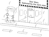
I have made my own shot. Its a kind of wide shot, framing the movie theater from outside, you can see the main movie board, the box office, footpath, road and the poster n subjects. The poster is illuminated from the top, the light also falls on the subjects. This I feel is a essential first shot, coz it summarizes to the viewer about the location where this incident is taking place. And as the subjects are illuminated by the light on the poster, they wont be missed in all the hub-bub on the street.

Shot 2
For shot 2, I will choose image number 15 from your list, its a close up shot. The frame shows the poster, which immediately becomes the center of interest coz both the subjects are looking at it. Its also a introduction shot of both the subjects, though the angle of the camera doesnt completely describe the younger character (shows back of the head), shifting the angle a lil bit will do the trick." - 4 points + 2 points for an original drawing (22 March 2007)


Cameron is the best says,

"1st shot - #15: It automatically grabs my attention and makes me question why they are staring at the poster.

2nd shot - #22: It shows the older person as larger which makes him/her look wise and intelligent, The younger person's head it tilted upward towards the older persons as if they admire them. " - 4 points (24 March 2007)


The Mirror says,

"1. A panoramic view, moving very slowly to the interest point: the movie theatre. Is the place where the question appeared, a magic point, a place where the seeds of multiply possibilities come to life.

2. The young person face and his expression of wonder. Everything dies in his eyes and becomes part of his mind." - 4 points (5 April 2007)

Note from Instructor: Remember, a script can be turned into an animated motion picture which can have very unusual visualization. This movie does not have to be realistic live action. Always keep an open mind when you read a script. This is an excellent example from The Mirror.


Kroebuck67 says,

"I would use Deimos described first shot (21) with the additional action of the Young Person and Old Person exiting the theater, to stop in front of the marquee.

My second shot would be 15, as it would transition best into the upcoming dialogue. " - 4 points (16 April 2007)


Jack21 says,

"My answer would be #12 and #13." - 2 points (21 April 2007)


Kinsuji says,

"On the first shot, I would use no. 21. I would like to show to everyone where everything is going on. The time of a day, the place of action. Then with slow zooming (if possible) to pict no.1. It would still be the one shot I think. And it would fit the best for my script too :).


For the second shot, I would choose no. 4. It would best represent the both characters. From that shot everyone can see clearly the young and the old person. Differences between them. Emotions and gestures they make (again from my script).

I can explain why I didn't chose a shot where you can clearly see a poster. (If slow zoom to pict no.1 is impossible.) First of all in pict no. 21, you can see the name of the movie and the small poster itself. And the in the shot no.4, it is obvious that they are looking at the poster. The viewers imagination would make bigger impression than the bigger poster on screen. (In my opinion of course:)) " - 4 points (26 April 2007)


Stewart says,

"For the first shot, I would use shot #1, because I want to communicate the focus on the poster to the exclusion of anything else. Second, I would use shot #22, since in my script, the young person is the first to speak. The camera is pointed at her face already, and the first dialogue in the script is the younger person's question to the older person---when the older person speaks, this camera angle gives the best angle for such an effect." - 4 points (29 April 2007)


Eze says,

"21 for the first shot because it feels like an establishing shot. People coming out of the cinema, cars passing by... 8 for the second because you can inmediately see the poster and the two characters involved. Afterwards I would use the close ups." - 4 points (30 April 2007)


Ltjlogic says,

"Question 1:

I believe the first shot could be shot number 21. It is the first shot of the short movie and it shows the movie theater, and the two people standing next to the poster. This gives the viewer all the information that they need to be able to understand that these two people are at the movies, that it is at night, and you briefly see that there are two subjects, which later we will get more information when they converse.

Question 2:

For the next shot, I would choose number 15. I chose this shot because it is more interesting than 8 or 1. It's a lot more interesting to see something with more perspective than two people standing parallel to the wall. With less perspective (shots 1 and 8) the shot is not as lively, we don't get the feeling of the 3D shapes as we do in shot 15. " - 4 points (1 May 2007)


BSB says,

"My pick for the first scene would have to be 21. The reason being that it is a wide shot during (preferably) dusk exposing not only the color scale, but more importantly the over all mood of the story and film.

My pick for the second scene would have to be number eight. Though it may look like a cheesy close up, it would show what the characters were looking at and show texture. Plus, it would signify the symbolic relationship between an older generation to a newer one." - 4 points (10 May 2007)


Havryliuk says,

"I chose picture 4 for the first frame. It shows the characters of the film. But the poster in not still there. So the viewer is wondering what they are looking at.

The second frame would be picture 10. It shows the poster in closeup. So that becomes clear what they are talking about." - 4 points (15 May 2007)


Fanninator says,

"For the first frame I would choose #10 because it shows the movie poster which is what they are looking at. Then I would pull back to #8 because it shows the characters looking at the poster." - 4 points (17 May 2007)


Munibaron says,

"Frame one is Pic 21

Frame two is Pic 1

Reason:

Pic 21 showing a high level theme of the Story.

and

Pic 1 can explain the initiation of the story clearly" - 4 points (17 May 2007)


Niri0n says,

Shot 1: 21

Shot 2: 3 or 4

"I want a very broad view of the first scene to set the context for the viewer. The second shot should show the persons involved. It should not break the 180 degree rule, so any shot taken from the side showing the old person closer to the camera would be bad. But any shot from behind or the side with the young person closer would be ok. I want the picture to show the emotions and state of mind of the characters. I would maybe choose a perspective a little higher up than waist, so maybe neck height." - 4 points (22 May 2007)

or

Continued on next page


Answers to the Pop Quiz on thumbnail storyboarding (continued).

Kasturika says,

"Answer 1:
As the story begins, the characters are introduced as standing outside the theatre so we should show the theatre first and then focus on the characters
By showing the theatre or a poster of the movie, we can create an interest in what is about to happen, we can then focus on the two characters. This way the viewer can understand in what context the people are talking.
Thus, the first shot should be of the poster, that is image number 10
Answer 2:
Once the poster is shown, we can focus on the characters. We must show both the characters as looking at the poster. Further, we have to show 'who' they are, that is, there is an old person and a young person
Image number 3 is suitable for this purpose. It highlights the curiosity of the younger person as well as the wisdom of the older person while they are looking at the poster " - 5 points (23 May 2007)


A. Straea says,

"I would choose frame 17, followed by frame 10. Frame 17 shows both characters, but is mainly focused on the younger person, giving the audience the impression that this younger person must be the character that moves the story forward. I would have it followed by frame 10, which explains what the two characters were looking at. At this point not much can explain the significance of the poster just yet, but it gives the impression that the two had just seen (or planning on seeing, if the dialogue isn't taken into account) that particular movie. " - 4 points (27 May 2007)


or

Disilver says,

"First Shot:

The set-up shot Image 21. This long shot of the exterior and characters sets the scene.

Second Shot:

Image 3. Curious Young Person (CYP) is probably our 'star.'

Image 22 is also good. Either shot gives us a more intimate look at the characters. The partial visibility of the movie poster helps put their conversation in context. These are both limited depth of field shots with the CYP in focus. But Image 3 emphasizes the CYP 'star' by putting her up front while the camera angle emphasizes the stature of the supporting Wise Older Person (WOP) in the background. These WOPs are the target audience we're flattering into a buying decision." - 4 points (30 May 2007)


Tpayne says,

"First Shot - frame 21. This is a great establishing shot. It shows the characters looking at the poster as well as showing the movie theater our characters just exited.

Second Shot - frame 4. I would use this shot when the young character starts dialog. We have already established where the characters are and what they are looking at, now this shot gives us a clear view of what both characters look like." - 4 points (30 May 2007)


Wachapon2 says,

"As a first shot I would use #21 because it gives us an establishing shot of the setting and then #15 because it gives us a better perspective of what the characters are doing and what is it that they are looking at clearly." - 4 points (2 June 2007)


Velvetborzoi says,

"I choose picture 21, as it shows a long shot of the 2 subjects with the whole background. The first shot should set the tone for the film, and give us a feel for the characters in it. For the second shot, i'll go with picture 20 which shows the older person closr to te camera, and the younger person away from it. It's a metaphor for the bigger, older, ? wiser old person, to whom the younger one looks up to. Finally, i would like to extend my appreciation to you and this site for sharing your expertise with the nebies. Thanks." - 4 points (6 June 2007)


AgentOO says,

"I have chosen to expand on frame 21 and create one for myself as an opener. All of the rest of the frames are great however they seem stagnant to me. They do not give the feeling of a just watched a movie as an opener; instead the characters seem like they are going to choose the film not review it. One of the main reasons I choose this route is more observational than anything else; people view the poster on their way in and rarely on the way out. I like the way that frame 21 also visually explains what movie is/was showing, what time of day it is, and possibly even that it might be a last show.

My Second choice is frame 13 this depicts the most interaction about a conversation after a film to me." - 4 points (19 June 2007)


Tunderboy9 says, "I think that should be the nr. 10 Because you begin by the poster and than the old person comes to the right side and the old person from the left side. And that is when they began speaking. The second shot should be the nr.8." - 4 points (7 July 2007)


Mok says,

Shot one:
It shows all the elements in the frame as a preface to the story, and to be the reference that makes us see the whole picture. It also puts a question “What they are looking at?” We are seeing the poster but we aren’t seeing its details.
Shot two:
“The poster” Now we could see the details clearly. Such details are the answer of the previous question. - 5 points (20 July 2007)


or

Izwah says,

My first two shots are #21 and #19 or #5.
Why?
My 1st shot is #21 because it establishes the scene with appropriate location, time, moods and atmosphere necessary for it. It also provides and introduction to the two main characters in this story - standing next to each other as the camera shoots closer to them.
My 2nd shot is either #19 or #5 because it establishes the young person's facial reaction, which holds the key to the subject brought up later by the dialogues. Shot #5 is acceptable because of the fact that it shows the facial reaction of the young person, but also recognizing the character next to the young person, so it won't be ignored by the viewers. - 5 points (21 July 2007)


Mpd1216 says, "I would use number 21 showing the marquee and zoom into the 2 characters. for the second scene I would use number 6 changing the focus between the characters as they each speak." - 4 points (21 July 2007)


Krishna Datta says, "I will use 15 as it shows both the older and the younger person standing out and looking at the poster.

The second screen will be 22 where the younger one is looking into the screen curiously." - 4 points (23 July 2007)


Fred says, "I'd probably shoot the first shot with a good general view like fig.21 and then move in for some facials (fig.3)." - 4 points (August 3 2007)


Axel says, "I would shoot NO.1 then NO.17, so as to create the feeling that they are alone, just them and philosphy. The child speaks first and that is wy the second shot has to look at it's face." - 4 points (4 August 2007)


Mpftmead says, "I would say to go with shot 4 as it interests the viewer into what the two are looking at then I would zoom in to shot 10 to lighten the viewers minds and to give insight as to what's going on." - 4 points (6 August 2007)


Padam says, "I think that the first shot should be number 21, as it establishes the setting and a little of the subject of the short film. Then number 11 as this introduces the characters to the audience at a fairly easy angle. " - 4 points (6 August 2007)


Wikichic says, "well i'd have to say the first shot would be #4, cause we can cleary see the characters, and the camara shows them looking up, but doesnt show what they are looking at, also, in a way, it looks like there looking at something with pride. Then for the second i'd pick the 21, cause the camara pulls back and shows what they are looking at, and we realize it's a movie poster, and that there proud of what they just saw, in my own experience sometimes after i've seen like an epic action..you name it, flic.. when i come out of the theater its like wow!...and i think i would love to roleplay in that world ..." - 4 points (6 August 2007)


Refardeon says,

First Shot: 15
Establish outer setting - Young and old person standing in front of Star Wars poster
Second Shot: 3
What is interesting/important? The thoughts and the interaction between the two persons. Shot 3 shows their faces with their feelings and interaction - they are still looking straight and reading/thinking." - 4 points (10 August 2007)


Noblerinthemind says,

2) would be my first shot because I think its a bit of a quirky shot that gets the audience curious since we don't know what he's looking at. But it gives some information because we can see that he's on a sidewalk looking at something.
3) would be my next shot because it adds the second character to the mix, but again doesn't give too much information. " - 4 points (15 August 2007)


KinnetiK says,

My answer would be Frame no.6 as the first frame of the movie (I chose it because it shows both of the characters, but i think it reflects the curiosity of the young person).
For the second frame of the movie, I would have to say no. 21, because the viewer must understand the object of reflection (the theme of thought). - 4 points (22 August 2007)


Remaley says,

On Pop Quiz, would use 21 (with the addition of persons exiting the theatre), followed by a cross fade to 13, and making the transition somewhere around the Young Person's "but..." in the first line of dialog. - 4 points (23 August 2007)


Dorothybaez says,

First shot: side view of both people shot from below as they are looking at the movie poster. At this angle the poster is just barely outside the frame.
Second shot: camera pans right and moves out so both the people and the poster at their right are visible. - 4 points (30 August 2007)


Youtheen says,

"The first shot is nr. 10, the close-up of the movie poster. The second shot will develop from the first and is no. 8. The idea is to see first the glamorous poster, full of action and vitality and, then, to see two drunken russian homeless staring like some idiots at it." - 4 points (23 August 2007)


Sushant says,

"My first frame for the shot would be SAMPLE 1. However, the poster in the shot would be bigger than the one given in the sample. I intend to give the STAR WARS movie a 'larger than life' angle with this poster. It will be obvious that the two characters are looking at the poster. I stay at the shot for 2 seconds and then move on to the next frame.
This frame would resemble SAMPLE 11. I would want to focus on the expressions of the characters, showing a calm look of appreciation on the OLD MAN's face and a look of contemplation on the YOUNG MAN's face." - 4 points (30 August 2007)


Moraistelmo says,

1. I think the first frame to that movie should be 21. That's because it introduces the setting.
2. The second one should be 8. - 4 points (6 September 2007)


Thorlach says,

I choose # 15 for the establishing shot. Then #16 to focus quickly on the young person who starts the dialogue. - 4 points (8 September 2007)


Nator7 says,

I would choose shot 21 as my first shot as it establishes the location and context of the story with the theater and movie title.
I would choose shot 8 as my second shot as it establishes the characters of this movie in relation to the location and context. - 4 points (19 September 2007)


Sozou says,

Preferably, I would use the 10th of the selection. It's simple and the scene starts off with telling us what to expect: Either a film or people talking about a film. In this case talking about a film. The second frame would be the 8th of the selection. It shows us who will be talking. - 4 points (23 September 2007)


Nishtala says,

11 is my answer for the first frame. I chose this shot because it clearly shows old(wise) and young(curious) man just outside the movie theater.
22 is my answer for the second frame. I chose this shot because the two characters are going to stand here looking at the movie poster for sometime.And they are about to say something after this shot...so there expressions just before they say something have to be captured because the expressions on their faces just before they say something depict the act very clearly. - 4 points (25 September 2007)


Sunayana says,

I would choose #1 as the first frame because it establishes the location, time and the characters. I also feel this frame expresses the 'reference-to-context' most effectively.


Since the young person speaks first, i would l like to cut to #13 as my second frame getting a closer look at the expression of the young person while the older person is still in frame. - 4 points (27 September 2007)


October 10, 2008 -- Ironcode says,

Answer #1
Good establishing shot for the scene.


Answer #2
Shot with all the relevant objects. The poster and the two characters.


Answers to the Pop Quiz on thumbnail storyboarding (continued more).

Elisia Johnson says,

My first frame would be Frame #1 because it would establish the location of the story and what characters are involved.
My second shot would be Frame #15 because it shows that the two characters are looking at the poster and it would also allow the audience to get a closer look at what the characters are looking at. It creates suspense because the audience will be wondering what the interest is in this poster - 4 points (01 October 2007)


Syed sibte hassan says,

I would prefer frame no. 21 created by Deimos. Let me explain you why? the reason why is just because of it is not only the scene but also beginning of the film and here we have to tell the audients that where its took place? and what's the atmosphere around this place? and its shows other peoples activities also it is covering each & everything quite nicely so i think it is very suitable as a first shot of the film.
Second shot should be the 11th one because it is showing our both characters quite nicely which is we have to show our both characters now so it is doing good job that’s it. - 4 points (03 October 2007)


Qwidgey says,

My first shot would be frame 21, a wide establishing shot so that the viewer knows who our characters are and what the location is.
My second shot would be frame 3 because you can see who's talking and what the poster that they're talking about. - 4 points (05 October 2007)


szahra says,

For the first shot I had to decide upon 15 or 3. The reason being that both of those show the poster so that the audience can see what the two people are looking at and also get a glimpse of the 1 persons looking at it. Since (3) shows the two people's faces I was tempted to choose that over (15) but what I like about (15) is how it shows the proximity of the 2 people and that they are both looking at the same poster. From here my second shot will most likely be (4) where the audience gets the front view of the two persons before they start their conversation. - 4 points (05 October 2007)


Elizabethvnv says,

Question 1

First frame: Frame 21 from the options (a wide shot of the outside of the theater with the two characters standing in front of the movie poster.
Reason: This gives us the full information of where they are and therefore why their conversation is relevant.

Question 2

The second shot should begin with a close up of the boy’s face, the boy smiles as he speaks the first line “That was a great movie...” then his face turns puzzled as he speaks the rest, then zoom out while he is still talking so you can see both characters standing side by side.
Picture no 2 for the second frame and first part the young person's first line, then move the camera to picture no 6 for the second part of the young person's first line.- 4 points (16 October 2007)


Igor Verstovsek says,

Question #1 - What is your first frame for this movie. Why?

Shot from a distance - #21. Provides the context for the scene and sets the overall mood of the scene. You can display the dullness, gray colors, etc.

Question #2 - What is your second shot for this movie?

Shot #3 - the shot displays both characters and the poster, so it is consistent with the previous shot. It also retains the same angle as in previous shot (persons are to the left of the camera).
It introduces the characters, focuses on the younger one. It is shot from her height (with the older figure "above"), signaling we will tell the beginning of the story story from the perspective of the younger one. - 4 points (25 October 2007)


Matt James says,

Question #1 - What is your first frame for this movie. Why?

My first frame would be 21, the reason for this is that it gives you a good idea of the setting and includes both characters looking at the movie poster also.

Question #2 - What is your second shot for this movie?

My second shot would be 8, becuase it is a closer view of the poster and also gives the chance to see both characters interact with each other when the first bit of dialogue is spoken. - 4 points (29 October 2007)


Cristiana says,

This story is about an old person and a young person who had just saw the movie "Star Wars". Now they are out looking to the wallpapers. For this action i have chose FRAME No.15 because in this frame we can clearly see the two persons and also the wallpapers.This shot is taken from behind to surprise them looking we can see the place where they are and after this shot comes FRAME No. 3. This is perfect this frame show us in the main plan the young person who really looks curious and he was impressed by the movie (we know that this young person is very curious so the camera is focused on him) and next to him is the old person who`s not cut or outside from the frame so this is very nice cause we can catch both and come out with what we are looking for to represent to show the young person that is curious. - 4 points (05 November 2007)


Silver Tonto says,

Question #1 - What is your first frame for this movie. Why?

Shot 1 - Establishing shot introducing both characters as well as setting.

Question #2 - What is your second shot for this movie?

Shot 10 - Establishing the premise of the story or subject -the poster will reveal visually that the story is related to the theme of Star Wars. - 4 points (20 November 2007)


Anandabrata says,

I would choose, frame 8 as the first one. The reasoning is that I want to establish that they are outside movie theatre, the movie they have watched shows on the poster, it has both characters and their round about ages. My second frame would be 11, I want to get the expressions of the two people and also maintain continuity of the frames, also that they both are not strangers but together. - 4 points (29 November 2007)


Janis Hartman says,

On the storyboard: The first shot should be #21. This wide shot gives the audience a lot of information. It is night, outside a movie theater, Star Wars is playing and an older person and a younger person stand next to each other. The next shot should be #22. The camera is centered on the young person, (the first to speak), yet includes the old person, whose nonverbal and verbal response is next. The close up makes the scene more intimate and personal. - 4 points (02 December 2007)


Manuelciosici says,

I would choose option 21 but move the camera a little bit more to the right and film the two characters as they exit the movie theater. I think this should be the first frame because it starts while the characters exit the theater. This would my choice for the first scene because it introduces the viewer very easy to the initial situation. The camera would then approach and move into a position similar to the one in frame 3 . The difference between my frame and the third would be that the camera would be distanced a bit a placed a little more to the left oriented slightly towards the poster. This would make both of the characters and the poster clearly visible so that the viewer can engulfed rapidly into the universe the film is creating. - 4 points (04 December 2007)


pruthvirajg says,

QUESTION 1
FRAME 1: I WILL CHOOSE THE 21 FRAME AS THE FIRST ONE FOR MY SHOOT. IT WILL SERVE AS AN ESTABLISHING SHOT BECAUSE IT CAN SHOW LOCATION(THEATER EXT.),SUBJECTS AND THE STREET. WITH THIS FRAME I THINK THAT THE NARRATION CAN BE STARTED WITH THIS ESTABLISHMENT OF CHARACTERS AND LOCATION.
QUESTION 2
FRAME 2: FOR THE SECOND FRAME I WOULD CHOOSE FRAME 15. THIS WOULD BE APT BECAUSE AFTER ESTABLISHING THE LOCATION , WE SHOULD ALSO ESTABLISH THE CHARACTERS AND MAIN POINT OF STORY THE STAR WARS MOVIE(WHICH IS DEPICTED IN THE POSTER). BOTH THE CHARACTERS ARE AMAZED BY MOVIE THEY JUST SAW AND ARE STILL AWSTUCK SO THEY ARE WATCHING THE POSTER. IN THIS ANGLE WE CAN GET GOOD DETAIL OF POSTER AND CHARACTERS - 4 points (09 December 2007)


brynsee says,

Answer #1 - I choose frame #1 as the first frame of the movie because it shows the characters looking at a movie poster from behind.
Answer #2 - I choose frame #16 as the movie's second frame. - 4 points (13 December 2007)


Davidmp4 says,

My first frame would be number 21, to set the location.
Second would be number 1, to set the conversation. (20 December 2007)


Hdepuydt says,

Answer 1: hot 20 for frame 1: That is the first shot, so you see the faces of the 2 personages. One from the older man,that is looking Old en wise, and the other of the curious kid.
Answer 2: Second would be number 1, to set the conversation. (19 December 2007)


mkatcher says,

I am ashamed to say that I would use number 21 though I don't think I would have the characters outside in the first frame. It seems that everyone wants that one, but I assume that is because it is an excellent establishing shot. My second shot would be number four because it focuses the attention on the character who is first to speak but keeps the other character on screen and in focus. - 4 points (22 December 2007)


Brandon.weight says,

Question #1
I would choose Shot #21 as the first shot, because it would be evident that there are two people in the story, outside of a movie theater, and looking at a movie poster. It is a good shot for creating the initial setting.
Question #2
I would choose Shot #22 because this time, the viewer will be able to see the facial expressions of th e characters while they are looking at the movie poster. This will also allow for an easy transition into dialogue. - 4 points (27 December 2007)


Dmc1981 says,

Question #1
The first shot would be of the the clear night sky, full of stars. The camera would move slowly down to reveal our two main characters stood outside the cinema. The reason I would use this as the opening shot is that it is the same shot used to open the Star Wars films and would would work as a reference to the film which they have just watched. It would also show the location and time of day from the off.
Question #2
The second would be a shot of the poster with the tag line, "Seduced by the Dark Side." The reason being that this is the main theme of the script. - 2 points (29 December 2007)


Sereyaco says,

Question #1
My frist frame would be frame no. 21 - Because it has a wide shot of a movie theater and it ehances the theme for the scene, its also good if there are few people entering and exitng in the theater.a few camera movment will be good for this scene
Question #2
And my second fram will be frame no. 22 - I like the balance between the wall and the old person, and a few camera movment will be good for this scene. then at first the old person wll be out of focus, then when he starts to speak the camera will be focused to her. i also like that the poster is not that exposed. - 4 points (30 December 2007)


Aodonnell says,

Question #1
I like #21. It directly shows how where they are at.
Question #2
I like #22 for its angles. - 4 points (14 January 2008)


Venks says,

Question #1
Thinking that the red shirt is the young fellow.
1st scene -15


Question #2
2nd scene -13 - 2 points (18 January 2008)


jeff w says,

Question #1
First frame #8
It's a decent establishing shot.
Question #2
second frame #22
Helps support the first shot and now we can see the characters faces, mainly the young person who has the first speaking part in the story. - 4 points (24 January 2008)


Marcus Mac says,

Question #1 & #2
I would start off with shot 21, to establish where they are, then cut to a medium shot from the poster with the characters looking almost directly into the camera, for a more intimate feel during the dialog.(2nd shot attached) - 4 points (28 January 2008)


Abenisio says,

Question #1
The first frame for the movie is going to be frame 1 because you get a full glance at both characters and the poster.


Question #2
For frame 2, I am going with frame 4 because the poster is no longer needed and you gegood shot of both characters with a closer look at the young person who begins dialogue. - 4 points (01 February 2008)


Mashenka says,

Question #1
As my first frame, I would choose the frame #21 (with the front view of the movie theater), because it provides the spectator with all the initial information: the location (exterior, near the movie theater), the movie the characters have just seen, the placement of our characters (standing in front of the small poster). We could also add some people exiting from the movie theater to indicate that the movie has just ended.


Question #2
A good second frame would be the frame # 16, because it helps to concentrate on our character (the Young Person). That's why we do not need to show the Old Person in this frame. I believe frame #16 is better than frames #2 and # 9 because in these frames the Young Person looks straightly at the spectator, but in frame # 16 we see him looking attentively at the movie poster. The camera is slightly above the Young Person, on the point of view of the Old Person. - 4 points (04 February 2008)


veeravikrama says,

Question #1
I would prefer Screenshot 10 as the first shot for my movie.
Why?
We've to communicate to the audience that the characters have just exited from the theater and that too after watching the movie "Star Wars". Hence the excitement starts the moment the audience see poster of 'Star Wars'. As the initial 5 seconds are very crucial, this will paint a very solid picture in the minds of the audience.


Question #2
For the second shot, I would slowly zoom out from the poster to 'Screenshot 8' which shows two people standing facing the poster. This will communicate that two people are standing and thinking something about 'Star Wars', which obviously the audience would also be thinking by now. This will help the audience to relate to the people standing. - 4 points (07 February 2008)


Answers to the Pop Quiz on thumbnail storyboarding (continued more).


Tbe878 says,

Question #1
I would start out with frame #8, which would set the location and time of the scene. It also establishes who is there and what they are doing.


Question #2
Once the dialog starts, I'd switch to frame #3. This lets us see the characters and the film, and while the focus is on the Young Person, the camera is angled so that the Old Person appears to be taller. - 4 points (16 February 2008)


Anthony519 says,

Question #1
I think the first frame for this movie would be frame 8 because it shows both characters and the actual point of the movie, which is the movie poster.


Question #2
My second shot for this movie would be frame 13 because since the younger person is the first one to talk, you would want to focus on him/her and the younger person in the frame is looking at the older person signaling that he/she is about to talk. - 4 points (19 February 2008)


Vikramshastri says,

The first shot would be Image # 10...
Reason - The audience will see movie poster clearly....


The second shot would be Image # 8...
Reason - The characters are introduced here.... The audience will know that both characters are looking at the poster of Star Wars movie. The camera angle of both the images is same... So zoom out effect can be used here... - 4 points (1 March 2008)
Alternatively,

Vikramshastri says,

The first shot could be Image # 8...
Reason - The characters are introduced here.... The audience will know that both characters are looking at the poster of Star Wars movie.


The second shot would be Image # 13...
Reason - The young person is about to start a conversation with the old person.....


Xvat0x says,

Question #1
My first frame would be from across the street, showing the backs of the Old Person and Young Person looking at the movie poster outside the theater. This way the audience will know where the characters are, and what they're doing.
Question #2
My second frame would be to put the camera in the place where the poster is, so the audience would be looking at the Old Person and Young Person from the front. That's when the Young Person looks up at the Old Person and starts asking him the question. - 2 points (03 March 2008)


Maramraj says,

Question #1
Frame 8 would be the first shot as they look at the poster even audience can see what they are looking at.


Question #2
Frame 13 would be the second frame, since the younger started saying something. - 4 points (6 March 2008)


Raj librans says,

Question #1 & #2
according to me 21st frame should be the first frame and 8th frame should be the second frame - 2 points (March 26, 2008)


AmosNusheg says,

Question #1
1. I think the 3rd frame I would choose for my first shot, because it shows the two characters in the story and they seem to be in the rule of thirds. With the young person at the left, the old person in the middle, and the movie poster at the right.
Question #2
2. As for my second shot, I would choose the 8th frame, because it shows what the characters are looking at, which is a poster for Star Wars. - 4 points (March 26, 2008)


Brutal Enigma says,

Question #1
1. My opening shot would be similar to number 21 as I want the physical environment to have a palpable effect on the starkness and emotion of the scene:
EXT. MOVIE THEATER - DOWNTOWN - NIGHT
It is a hot summer night, it has been raining. The lights on the cinema marquee flicker.
The old theater seems to be closing; the downtown streets and sidewalks are empty and silent, save for the far-off din of a woman having an argument on a cellphone.
Question #2
2. My second shot, which would be the first shot with dialogue, would be similar to number 22 with the focus shifting from the YOUNG PERSON to the OLD PERSON as a moviegoer walks up the sidewalk toward them:
YOUNG PERSON
That was a great movie...
An exiting moviegoer, not looking ahead as they are walking, bumps into the YOUNG PERSON. The moviegoer walks on without remark. The YOUNG PERSON strikes an unneccessarily offended pose. - 4 points (March 30, 2008)


Njoymusic2 says,

Question #1
For the first shot, i would start with 10 and slowly zoom out to end with 8. but instead of having the old and young person already standing there, i would place only the young person on the left (standing, viewing poster). once the shot has reached what frame 8 looks like, with just the young person in it, the older person will walk in from the left, behind the young person, notice him/her standing there, and finally stand beside him/her to view the poster on the right side of the frame to conclude the shot.
  • starting with the poster introduces the subject of the movie, how people get seduced by the dark side
  • combining the young person and the poster in the first shot links his/her curiousity/fascination with the movie and how people get seduced by the dark side
  • the separation of the entrances of the two characters clarifies how their meeting was completely by chance


Question #2
As for the second shot, i would use a combination of frame 20 and 22, not as close-up as 20 but i like the more frontal view it has as opposed to the nearly side-view in 22. perhaps panning (is that the right word?) from shot 22 to shot 20 could work, but that might be too much movement since the 1st shot already involves zooming out. a few seconds into the shot, the young person (looking at poster) says "That was a great movie," and turns to speak to old person: "but I don't understand one thing." end of shot. oh, and everything's flipped, of course, because i've already placed the two people on different sides than in the original choice of frames.
  • the 2nd shot shows the faces of the characters for the first time, so a gentle 3/4 / side view would provide a better transition from their backs to a complete frontal view
  • in both 20 and 22, the young person is in the center of the frame, focusing attention in on him/her, because it is he/she who will say the first line and set the plot into motion
  • i like how both 20 and 22 are framed on the right (in my case it would be on the left) side of the shot by the old person, kind of suggesting a protective, guiding figure he/she will be to the young person
  • i especially like how 22 has the poster and the old person on either side of the younger person: showing how both will have an impact on the young, innocent, person. - 4 points (March 30, 2008)


Maji says,

Question #1
My first frame would be number 21 : Because at the begining you have to introduce the location. In 21. frame you can see that you have two performers, they're outside of a cinema and they're looking at a poster.


Question #2
The second frama sould be number 1: Because we have to see that they're looking at a star wars poster. - 4 points (March 31, 2008)


Eldorino says,

Question #1
As first frame, I would personnaly chose the number 8, where we clearly see both caracters and general subject. More personnaly, I would even put a camera moving forth, up to a close position in the same type as the picture. I think it would permit to anyone to see, in a simple but efficient way, what it is all about.


Question #2
As second frame, I would take the number 6, where we see both caracters, in a more focused way for dialogs. If possible, I would have done a little "transition" in where the background, including the older person, would become blur, just for the young person sentence. - 4 points (April 5, 2008)


Hicks999 says,

Question #1
I think the 1st shot in the storyboard would be #21 (despite being crudely drawn). This shot sets the scene as on several other shots, it doesn't show the location as outside a movie theatre.


Question #2
The next shot should be shot 3, this is because it introduces the characters and sets up the young person to start talking. - 4 points (April 5, 2008)


Heddesheimer says,

Question #1
I would start with a total of the theater for the first shot to set up the scene for the viewer. This will make it clear that we are now standing in front of a movie theater, maybe people are leaving the theater and you can see what has been played this evening.
Question #2
My second shot would be a close up to the movie poster, then a pan or dolly shot into a more total where you can see the two people in front of the poster. This will convey the connection between the theater (total view) and the movie that has just ended. The camera move shall then introduce the two actors.
Instead of using a camera move from the poster, the actors can also walk into the scene, stopping in front of the poster. - 4 points (April 5, 2008)


Jiffypop says,

Question #1
I'd start with #21 and zoom into # 8.


Question #2
  1. 21 establishes the scene, and zooming into # 8 leaves the wacther eager to know what is being looked at until we finally get there. - 4 points (April 5, 2008)


Pisomojado101 says,

Question #1
I would choose frame 4 for the first shot of the movie, because it captures both of the movie's main characters. In this shot, you can tell that they are looking at something, yet you don't yet know what they are looking at.


Question #2
I would choose frame 2 for the second shot, because it captures both of the characters, and the poster is completely in view. This brings into focus the two main elements of the movie: the characters, and the plot (which is, in this case, Star Wars). - 4 points (May 17, 2008)


Completed assignment - Pop Quiz

May 19, 2008 -- Flowdark says,

Question #1
I will use the frame number 21 .cuse i think its good for introduce for the secene.


Question #2
I take the frame number 6 due to the story.
Completed assignment - Pop Quiz

June 12, 2008 -- Rick14 says,

Question #1
My answers would be to frame first image 14, a more panoramic view,


Question #2
and then slowly zoom in to 8, where the dialogue can get started properly.


Completed assignment - Pop Quiz

June 15, 2008 -- JoshLobel says,

Question #1
My first frame of the movie would be 21 because immediately establishes the setting - we know we have two characters at night, outside of a movie theater.


Question #2
My second frame would be 22 because it creates the contrast of one character being younger and the other older while showing that they are looking at a movie poster.


The next exciting lesson

Now start with the introduction for creating the thumbnail storyboards.


Contact your instructor

Your instructor for this filmmaking class is Robert Elliott. You can email me by clicking here.