Scion Image
| Subject classification: this is a biochemistry resource. |
| Subject classification: this is an information technology resource. |
Scion Image is a free of charge software, property of Scion Corporation that may be used for capture, showing, analyzing, enhancing, measuring digital pictures. There is an online manual that can be downloaded as well as a Beta 4.0.2 release (Does not require installation).


Hereby I am describing a series of steps for relative quantification of band proteins obtained in a technique such as western blot. These steps may be also used for densitometry of bands obtained in Southern blot (ADN) and northern blot (ARN) assays and in PCR product run in agarose electrophoresis.
- In order to get better result be sure not to overexpose the picture to be analyzed.
- Run the software.
- Go to the "Special" menu and click on "Load Macros" and then load the "GELPLOT2.txt" macro (it should be in the Macros folder together with the EXE file)
- Go to the "File" menu and click on "Open" (open the picture to work on. It should have a TIFF extension, not compressed, in black and white mode and with a length size between 500-800 pixels. The size modification can be done with software as photoshop). Be sure to have your picture in black & white mode in order to have accurate results. If the lanes are twisted you can straight them up with photoshop again: select the picture, press ctrl+T once and then hold ctrl as you drag the picture edges with the mouse until the bands are in the same line. Remember to save your pic as TIFF and it is better if you save it in the desktop.
- Go to the "Analyze" menu and click on "Calibrate". Then select "Uncalibrate OD" and click on OK (this is for the final result to be reliable). A window with a sigmoid curve should appear. This window can be closed.
- Select the dotted square from the toolbox and mark the area of your picture you wish to analyze (See picture).
- Go to the "Special" menu and click on "Mark First Lane". A temp window should show up.
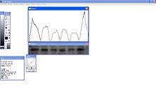
- Go to the "Special" again and click on "Plot Lanes". Another window should pop up showing a curve describing the variation of the intensity in the area selected at step 6 (See picture).
- Split the peaks as shown in the picture.
- Select the magic wand tool and click in the corresponding area under the curve from left to right.
- Go to the "Analyze" menu and click on "Show Results" (The appearing chart should show the values of areas under the curve from left to right. These represent the intensity across the box selected in step 6. Every peak corresponds to a band. The area under the curve is proportional to the intensity of the band and to the relative amount of whatever molecule you are studying: protein, DNA, RNA).